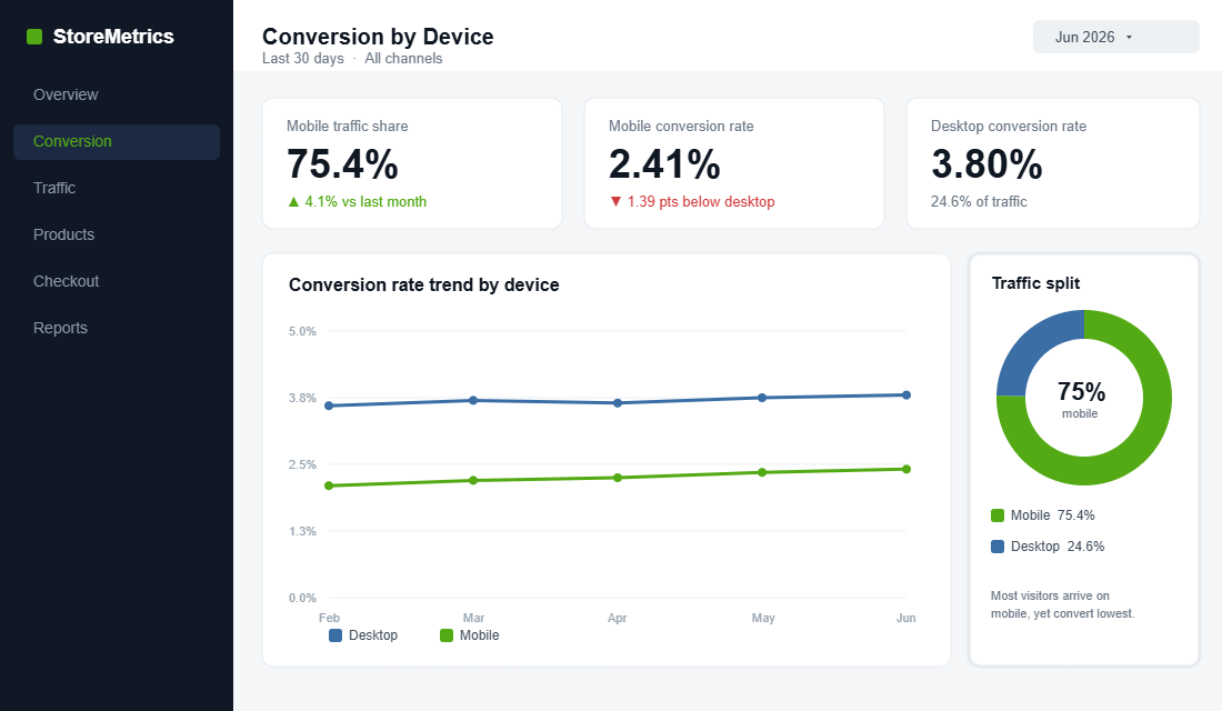
Open your Shopify analytics and look at the device split. For most Aussie DTC stores, somewhere between 70 and 80% of your traffic is arriving on a phone. Now look at the conversion rate next to it. Mobile is almost always the lower number, often by a full percentage point or more. That gap is not a quirk. It is the single biggest leak in most Australian stores, and it is hiding in plain sight.
What’s in This Article
The mistake most operators make is treating mobile as a shrunk-down version of the desktop site. They design on a 27-inch monitor, glance at the responsive preview, and ship. But your customer is standing in a Woolworths queue, one-handed, on patchy 4G, with a dozen tabs open. They are not browsing. They are deciding in seconds whether your store is worth the effort.
The brands that win mobile do the opposite. They design for the phone first and let desktop inherit. The payoff is real: YETI grew mobile conversions by 63% after a mobile-first overhaul, and Walmart Canada lifted mobile orders by 98% with a touch-first redesign. This is the playbook we use with hundreds of Aussie Shopify founders to close that gap, broken into six parts you can work through this week.
First, Understand the Mobile Conversion Gap
Before you fix anything, you need to see the problem clearly. Across the market, the average mobile ecommerce conversion rate sits around 2.9%, while desktop runs closer to 3.9%. That is roughly a full point of conversion you are leaving on the table for the majority of your visitors.
And mobile is not a side channel you can ignore until next year. In Australia, 95% of people now shop on a smartphone, with Gen X at 99% and Millennials at 97%. Mobile already drives roughly 26 to 30% of all transactions here, and that share is climbing more than 20% year on year. The traffic has already moved. The question is whether your store has caught up.
Why does the gap exist at all? Part of it is context. A desktop shopper is usually seated, focused, and using a device built for typing. A mobile shopper is distracted, often mid-task, and every small annoyance carries more weight. Part of it is habit: for years stores were built desktop-first and mobile was an afterthought bolted on at the end. The screen that gets the least design attention is the screen most of your customers actually use.
Here is the encouraging part. The gap is closing fast for brands that put in the work. Better mobile checkout, express payments, and faster pages have pulled mobile and desktop close to parity for the best operators. The leak is fixable. You just have to attack it in the right order.
Part 1: Speed Is the Whole Game on Mobile
If you only fix one thing on this list, fix speed. On mobile, every second of load time is conversion bleeding out. Google’s data shows that for every one-second delay in mobile load time, conversions can fall by up to 20%. Measured more precisely, conversion rates drop an average of 4.42% for each extra second between zero and five seconds.
The bounce numbers are even more brutal. When load time climbs from one second to three seconds, the probability of a mobile visitor bouncing jumps 32%. Stretch it to five seconds and the bounce probability rises 90%. And 40% of shoppers will simply leave a site that takes longer than three seconds to load. They never see your product, your offer, or your reviews. They are gone.
The usual culprits on a Shopify store are predictable. Work through them in this order:
- Oversized hero images. A 4MB banner that looks crisp on desktop is a killer on 4G. Serve compressed, correctly sized images and let Shopify’s responsive image system do its job.
- App bloat. Every app you install injects scripts that run on every page. Audit your stack and remove anything you are not actively using. Each dead app is a tax on every mobile session.
- Render-blocking scripts. Pop-up tools, review widgets, and chat apps often load before your content. Defer them so the product loads first and the extras follow.
- Slider and carousel libraries. Heavy homepage sliders are some of the worst offenders. A static hero almost always loads faster and converts better.
The metric to obsess over is Largest Contentful Paint, the moment the main content of the screen actually appears. Google considers anything under 2.5 seconds good. On mobile, your hero image is usually the largest element, so compressing it and giving it priority loading is often the single biggest win available. Run your store through Google PageSpeed Insights on the mobile tab and fix the worst offenders it flags first.
Test on a real phone over mobile data, not your office wifi. The experience your customer actually has is the only benchmark that matters. For a deeper teardown of where Shopify stores lose milliseconds, work through our Shopify site speed playbook alongside this one.
Part 2: Design for the Thumb, Not the Mouse
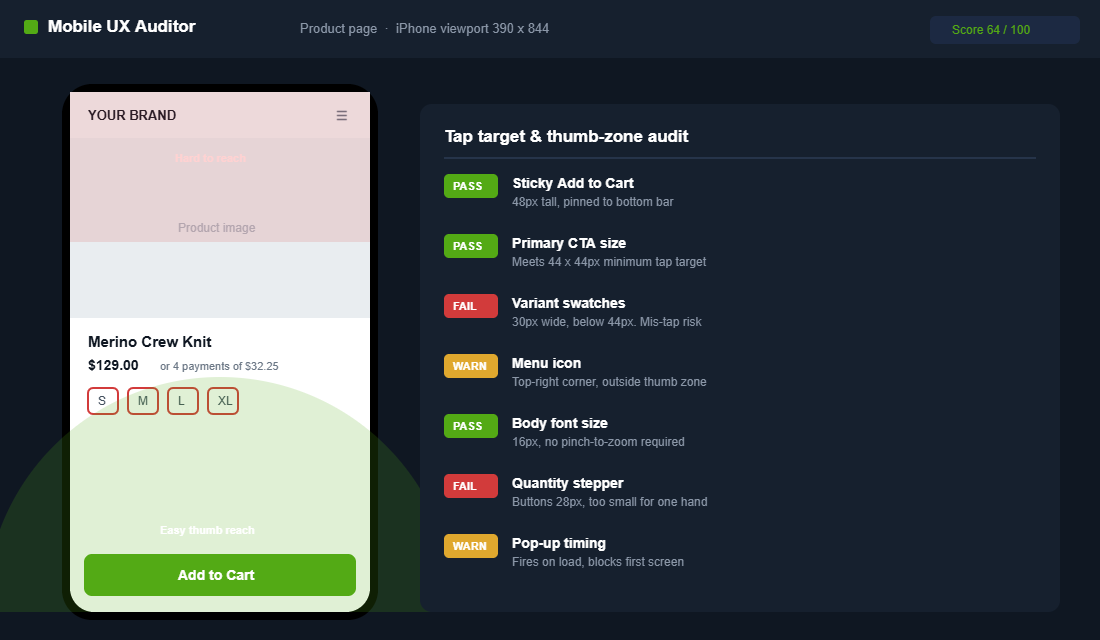
A mouse pointer is one pixel wide. A thumb is not. Around 49% of smartphone users hold their phone in one hand and tap with their thumb, and the average adult fingertip covers 44 to 57 pixels on a touchscreen. When your buttons are too small or too close together, people mis-tap, get frustrated, and bail.
The minimum tap target is 44 by 44 pixels per Apple’s guidelines and 48 by 48 per Google’s Material Design. Anything smaller produces measurable mis-tap rates that turn straight into form errors and abandonment. Check your “Add to Cart”, quantity selectors, variant swatches, and menu icons against that standard right now.
Then think about reach. The bottom third of the screen is the comfortable thumb zone. The top corners are the hardest to reach one-handed. So put your most important actions where the thumb already lives:
- Pin the primary CTA to the bottom. A sticky “Add to Cart” bar that stays visible as people scroll the product page lifts mobile completion by 5 to 12% in A/B tests, depending on the starting layout.
- Space your tap targets. Give buttons breathing room so a thumb cannot accidentally hit two at once. Crowded variant swatches are a classic mobile error source.
- Make text inputs big and obvious. Use the correct mobile keyboard for each field. An email field should trigger the email keyboard, a phone field the number pad.
Readability matters just as much as tappability. Body text should sit at 16 pixels or larger so nobody has to pinch to zoom, and contrast needs to hold up in bright Australian sunlight, not just in your dim office. A customer squinting at grey-on-white text in the car park is a customer about to close the tab. Big text, strong contrast, and generous spacing are not design luxuries on mobile. They are conversion mechanics.
Part 3: Strip the Path to the Product
On desktop you have room for a sprawling mega-menu and a hero with three competing messages. On mobile, that same clutter buries the one thing the customer came for. Mobile rewards ruthlessness. Every tap between the landing screen and the product is a chance to lose someone.
Start with what sits above the fold on the first screen. The customer should instantly understand what you sell, why it is worth their attention, and where to tap next. No giant logo eating half the viewport. No autoplaying video that delays the load. One clear value proposition and one obvious next step.
Then fix discovery. On mobile, navigation and search carry far more weight because there is no room for browsing by accident:
- Make search prominent. Mobile shoppers who know what they want will search first. A visible, fast search bar with predictive results shortens the path dramatically.
- Simplify the menu. Collapse your categories to the handful that actually drive sales. A short, scannable menu beats a comprehensive one nobody reads.
- Use sticky filtering on collections. When a customer narrows a collection, keep the filter controls reachable so they are not scrolling back to the top constantly.
Watch your pop-ups too. A full-screen email capture that fires the instant a mobile visitor lands is one of the most damaging things you can do. It blocks the content they came for, the close button is often tiny and hard to tap, and Google specifically penalises intrusive mobile interstitials in search. Delay the pop-up until the visitor has scrolled or shown exit intent, and make the dismiss target large enough for a thumb. A capture nobody can close is a bounce, not a subscriber.
The product page itself deserves special care, because on mobile it is where the buying decision happens in a single scroll. Our Shopify product page playbook and navigation playbook go deep on the layout choices that matter most on a small screen.
Part 4: Make the Mobile Cart Effortless
The cart is where momentum either builds or dies. On mobile, a full-page cart that wipes out the customer’s browsing context is a momentum killer. Every time you send someone to a separate cart page, they lose their place and some of them never come back to keep shopping.
A slide-out cart fixes this. It confirms the add, shows the cart total, and lets the customer either keep shopping or push straight to checkout, all without leaving the page they were on. It is one of the highest-impact mobile upgrades you can make, and it is where you surface free-shipping progress bars and relevant add-ons.
Get the mobile cart fundamentals right:
- Show a free-shipping threshold bar. “You are $12 away from free shipping” is one of the most reliable average-order-value nudges, and it works especially well in a slide cart where it stays in view.
- Keep quantity controls thumb-sized. Plus and minus buttons should be easy to tap without zooming.
- Surface trust signals early. Returns policy, secure-payment badges, and delivery estimates calm the nerves right before checkout.
For the full build, including app recommendations and the upsell mechanics that lift AOV without adding friction, see our Shopify slide cart playbook.
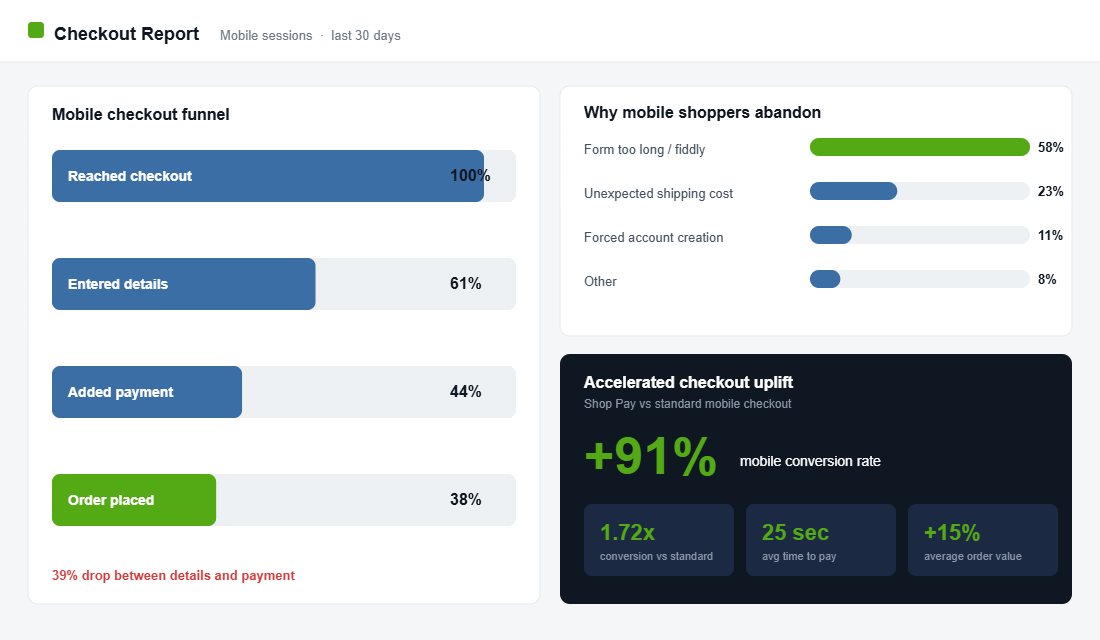
Part 5: Kill Checkout Friction with Accelerated Payments
This is the part most operators underestimate. Baymard’s research found that 58% of shoppers who abandon a mobile checkout do so because of friction in the process itself, not because they were not ready to buy. They wanted the product. The form got in the way. On a phone, typing a 16-digit card number, an address, and an email is genuinely painful.
Accelerated checkout removes that pain. Shop Pay, Apple Pay, and Google Pay let returning customers buy with a tap and a face scan, no typing required. The numbers are hard to argue with. Shop Pay can increase mobile conversion rates by 91%, delivers a 1.72x higher conversion rate than standard checkout, and processes a transaction in around 25 seconds. It also carries a 15% higher average order value than other methods.
Everlane is the textbook example. After leaning into Shop Pay, the brand saw checkout conversion run as high as 70% on those sessions. The lesson is not “Everlane is special”. It is that the typing was the tax all along, and removing it releases demand that was already there.
There is also a distinctly Australian layer here. Buy-now-pay-later is woven into how Aussies shop, and the majority of Afterpay and Zip activity happens on a phone. If your mobile product and cart pages do not clearly show that BNPL is available, you are quietly filtering out a slice of buyers who decide on affordability per instalment, not per total. Display the “4 payments of $X” message on the product page, not just at the final step, so the customer frames the price the way they want to from the start.
- Turn on Shop Pay and the express wallets. Enable Shop Pay, Apple Pay, and Google Pay in your Shopify payment settings so the buttons appear on the cart and product pages.
- Put express buttons above the fold. Surface the accelerated options before the standard form, not buried beneath it.
- Cut every optional field. Each non-essential field is a reason to quit. Ask only for what you genuinely need to fulfil the order.
Part 6: Diagnose the Leak with Session Recordings
You cannot fix what you cannot see. Analytics tells you mobile converts worse, but it will not tell you why. For that you need to watch real people use your store on real phones. The best free tool for this is Microsoft Clarity. It records sessions, builds heatmaps, and flags “rage clicks” and “dead clicks” where people tap something expecting it to work and nothing happens.
Setting it up on Shopify takes about ten minutes:
- Create a free Clarity account at clarity.microsoft.com and add a new project with your store URL.
- Copy your tracking code. Clarity gives you a short snippet. In Shopify, go to Online Store, then Themes, then Edit code, and paste it into
theme.liquidjust before the closing</head>tag. If you run Google Tag Manager, add it as a custom HTML tag instead. - Filter to mobile. Once data flows in, filter recordings and heatmaps by Device equals Mobile so you are only watching the segment you are trying to fix.
- Hunt for friction. Sort by rage clicks and dead clicks. Watch ten mobile sessions end to end. You will see exactly where thumbs miss, where pages stall, and where people give up.
One hour of watching mobile session recordings will teach you more about your conversion gap than a week of staring at dashboards. The fixes practically write themselves once you have seen the friction with your own eyes.
The Compound Effect: How the Six Parts Stack
None of these six parts is a silver bullet on its own. Their power is that they compound. A faster page means more people see your product. Thumb-friendly design means more of those people tap through. A stripped-back path means fewer drop off on the way to the cart. An effortless cart keeps momentum into checkout. Accelerated payments close the sale. And session recordings keep feeding you the next fix.
If you cannot do everything at once, sequence it by effort versus payoff. Enabling Shop Pay and the express wallets takes minutes and moves the number immediately, so do that today. Compressing your hero image and trimming dead apps is an afternoon of work for an outsized speed gain. The sticky add-to-cart bar and slide cart are theme changes worth scheduling next. Session recordings then tell you which of the remaining fixes your specific store needs most. Fast wins first, evidence-led fixes after.
Run the maths on a store doing $100k a month. If mobile is 75% of traffic and you lift the mobile conversion rate from 2.4% to 2.9%, that is not a rounding error. On most stores it is tens of thousands of dollars a month that were already in the building, just stuck behind friction. You are not buying new traffic. You are keeping the traffic you already pay for.
That is why mobile is the highest-ROI project most Aussie founders are not prioritising. The audience has already arrived on the phone. The work is making the phone experience as good as the desktop one you have been polishing for years.
Your Mobile Conversion Checklist
Work through this on a real phone, over mobile data, as if you were a first-time customer. Tick each item only when it genuinely passes:
- Speed. Homepage and product pages load in under three seconds on 4G. Hero images are compressed. Unused apps removed.
- Thumb design. Every key button is at least 44 by 44 pixels. Primary CTA is sticky at the bottom of the product page. Tap targets are well spaced.
- Path to product. The first screen makes the offer clear. Search is visible. The menu is short and scannable.
- Cart. A slide-out cart confirms adds without a full-page jump. Free-shipping bar is visible. Trust signals are present.
- Checkout. Shop Pay, Apple Pay, and Google Pay are enabled and shown above the fold. Optional fields are removed.
- Diagnostics. Microsoft Clarity is installed and filtered to mobile. You have watched at least ten real mobile sessions this month.
Knock these out one part at a time. Even fixing speed and accelerated checkout alone will move the number for most stores. The rest tightens it further.
Inside eCommerce Circle, mobile conversion is one of the core pillars we work on with every member, because it is so often the fastest win sitting in a store already. If you want a second opinion on yours, let’s talk.