Your revenue chart says you grew 20% this quarter. Good. Now answer a harder question: how much of that growth came from customers who already know and trust you, and how much did you rent from Meta at 45 dollars a head?
What’s in This Article
Most founders cannot answer it. They watch blended numbers (total revenue, total orders, sitewide conversion rate) and assume the brand is compounding. Often it is not. Often the store is a leaky bucket wearing a growth costume, quietly replacing lost customers with increasingly expensive new ones. The average DTC brand sees a repeat purchase rate of just 25 to 30%, which means the majority of customers you paid to acquire never come back.
Cohort analysis is the report that settles the argument. It groups customers by the month they first bought, then tracks what each group does next. It is the closest thing ecommerce has to a truth serum, and a version of it is sitting inside your Shopify admin right now, unopened.
Why Your Topline Is Lying to You
Two stores can both do 150k a month and be completely different businesses. Store A gets 40% of revenue from repeat customers. Store B gets 8%. This month their profit and loss statements look similar. In twelve months, Store A is compounding while Store B is begging the ad auction for mercy every Monday.
Blended metrics hide the difference because they average everyone together. Your loyal 2024 customers prop up the repeat rate while your 2026 cohorts quietly decay. The blended number still looks fine. The trend underneath it is a slow bleed, and you will not see it until the old loyalists finally churn out and the floor gives way.
The opportunity on the other side is real. Australians spent a record 82.6 billion dollars online in 2025, up 14% year on year, with 9.8 million households shopping online and 41% of them buying at least fortnightly, according to the Australia Post eCommerce Report. The second orders are happening. The only question is whether they happen with you or with the competitor who emailed your customer first.
And the prize for fixing it is outsized. Research by Frederick Reichheld at Bain and Company found that a 5% improvement in customer retention lifts profits by 25 to 95%. The probability of selling to an existing customer sits at 60 to 70%, against 5 to 20% for a cold prospect. Existing customers also spend roughly 31% more per order. Retention is not a soft metric. It is the highest-leverage line in your business.
Step 1: Pull the Cohort Table Buried Inside Shopify
You do not need a data warehouse or a 300 dollar a month analytics stack to start. Shopify ships a cohort report free on every plan, and most founders have never opened it.
- Open the report. In your Shopify admin, go to Analytics, then Reports, and search for “Customer cohort analysis”.
- Set the range. Choose the last 12 months so you have enough cohorts to see a trend, not a coincidence.
- Start with retention rate. Switch the metric to “Retention rate” first. Come back for “Amount spent per customer” on a second pass.
- Export it. Download the CSV if you want to model scenarios in a spreadsheet later.
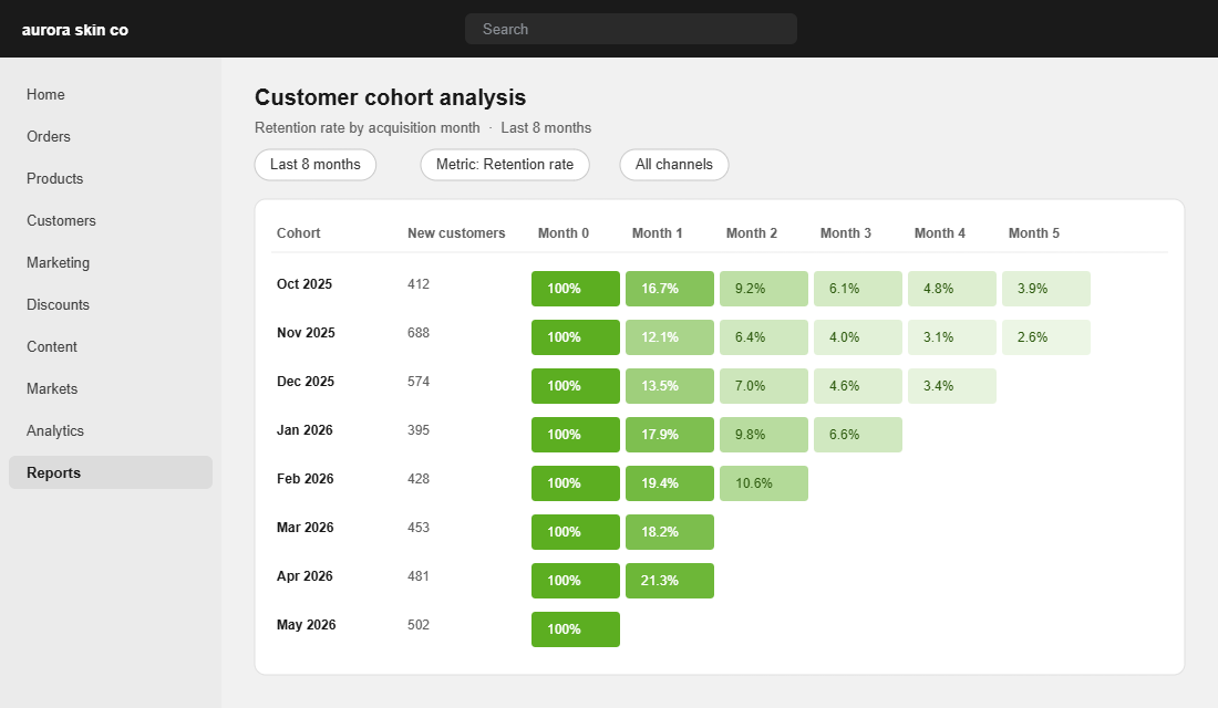
How to read it: every row is a group of customers who made their first purchase in the same month. Month 0 is always 100%, because everyone bought once. The columns to the right show the percentage who bought again one month later, two months later, and so on. The darker the cell, the stronger the cohort.
Two caveats before you panic over a single cell. Small cohorts are noisy, so if a month brought in fewer than 100 customers, treat its numbers as a hint rather than a verdict. And recent cohorts are incomplete by definition. A cohort acquired eight weeks ago has had no chance to show you its month 3 behaviour yet.
Step 2: The Three Numbers That Actually Matter
A 12-month cohort table has over a hundred cells, and staring at all of them is how founders end up doing nothing. Ignore most of it. Three numbers do the heavy lifting.
- Month-1 repeat rate. The percentage of a cohort that buys again within roughly 30 days. Real-world benchmarks vary hard by vertical: apparel sits near 15%, beauty around 23%, supplements around 26%. Consumable categories should always beat durable ones.
- Month-3 cumulative repeat rate. Industry analysis puts a healthy DTC brand at 20 to 30% of a cohort repurchasing by month 3. Under 15% usually signals a product, expectation or onboarding problem, not a marketing one.
- Median time to second order. The number of days between a customer’s first and second purchase. This single number should set the timing of every post-purchase flow you run. If your median is 38 days and your second-order email fires at day 60, you are turning up after the race has finished.
Then pair the table with your acquisition cost. Switch the cohort metric to “Amount spent per customer” and ask: by which month has the average customer in this cohort covered their CAC? If a January cohort still has not paid for itself by month 3, you are funding growth out of cash flow, and the maths of that catches up with everyone eventually. We covered the full working in our CAC payback period playbook.
Step 3: Diagnose the Curve. The Four Cohort Patterns
Once you have stared at a few cohort tables, you stop reading individual cells and start reading shapes. Four patterns cover almost every Shopify store we look at inside the Circle.
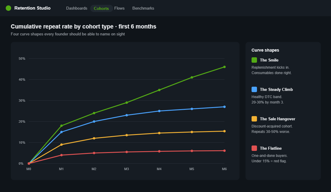
- The Smile. Repeat rate dips, then climbs as replenishment cycles kick in. This is the consumables curve done right. Your job is to time flows to land just before the natural reorder point, not after it.
- The Steady Climb. Cumulative repeat grinds upward into that 20 to 30% band by month 3. Healthy. Boring. Exactly what you want. Protect it and scale acquisition with confidence.
- The Sale Hangover. Cohorts acquired during heavy discount periods repeat 30 to 50% worse than full-price cohorts. Compare your EOFY or BFCM cohort against an ordinary month. If the gap is ugly, your sale strategy is buying revenue today by renting customers who will never pay full price.
- The Flatline. Almost nothing after month 1. Sometimes that is a retention problem. Sometimes it is just the category. A mattress brand like Koala was never going to see a 40% six-month repeat rate, and pretending otherwise wastes money. In one-and-done categories the play is average order value, referral and range expansion, not reorder flows.
One warning: check seasonality before you declare a trend. A soft February cohort in swimwear is weather, not strategy. Compare cohorts year on year where you can, and look for three consecutive cohorts moving the same direction before you change anything big.
Step 4: Fix the 60-Day Window, Where Repeat Revenue Is Won
Here is the uncomfortable truth your cohort table will show you: most second orders that ever happen, happen early. Once a customer goes 90 days without returning, the odds of reactivating them fall off a cliff. The stretch between day 14 and day 60 is where repeat revenue is actually won, and most stores leave it to a single generic “10% off your next order” email.
Three moves work consistently for Aussie brands in that window.
- Engineer a specific second purchase. Do not discount the whole store. Recommend the exact product that complements what they bought, at the moment they are most likely to want it. Your welcome flow should be built around this one job.
- Build a consumable ladder. Hismile is the textbook Aussie example: the whitening kit gets the customer in the door, then toothpaste, strips and serums turn a one-time buyer into a monthly one. If your hero product is durable, add a consumable companion product. The cohort curve changes shape within two quarters.
- Make replenishment frictionless. Who Gives A Crap lets subscribers set delivery cadence anywhere from monthly to yearly, and their case studies with Recharge show customers who add even one extra product to a subscription retain 7 to 15% better. Flexibility beats lock-in.
For cohorts that have already gone quiet, do not send the same message you send to fresh buyers. Segment them properly using the RFM framework and run a dedicated win-back sequence. Reactivating a lapsed customer still costs a fraction of acquiring a stranger, because acquiring a new customer runs 5 to 25 times the cost of keeping an existing one.
Step 5: Wire Cohorts Into Your Monthly Rhythm
A report you open once is trivia. A report you open every month is an operating system. The Shopify report is the right starting point, but once you are spending real money on acquisition, a dedicated LTV tool earns its keep because it puts cohort revenue and ad spend on the same screen.
Our pick for most stores is Lifetimely by AMP. Setup takes about 15 minutes:
- Install it from the Shopify App Store. There is a free plan for basic LTV reporting, and the Basic plan at 34 USD a month covers what most stores under a few million in revenue need.
- Connect your ad accounts. Link Meta and Google so blended CAC sits next to cohort LTV instead of living in a different tab.
- Open the LTV cohorts report. Filter cohorts by first product purchased and by acquisition channel. This is where the interesting decisions live.
- Set the weekly email digest. If the data lands in your inbox, you will actually look at it.
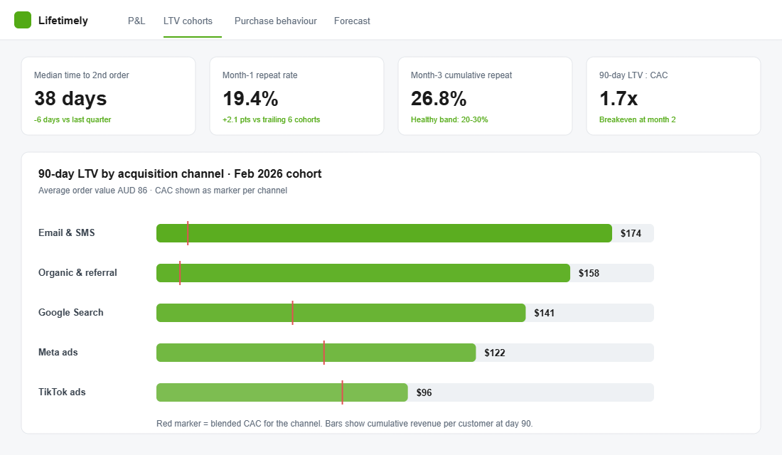
What you are looking for each month: did the newest complete cohort beat the average of the six before it? Which channel produced the highest 90-day LTV cohort, not the cheapest click? And which first product created the stickiest customers? Most founders discover one product quietly produces customers worth double the average, and that discovery alone reshapes the ad account.
Fold the whole thing into your monthly review alongside the rest of your numbers. If you do not have that ritual yet, our monthly business review playbook gives you the one-page format. Cohorts earn 15 minutes of it.
The Compound Effect: What Five Points of Retention Is Worth
Put the pieces together and the maths gets persuasive quickly. Say you acquire 500 customers a month at an 86 dollar average order, and your month-3 cumulative repeat rate is 18%. Lift that to 24% through better second-order engineering and timed flows, and that is 30 extra repeat orders a month at near-zero acquisition cost, roughly 2,580 dollars of monthly revenue that drops mostly to contribution.
But the visible orders are the small half of the prize. Customers who make a second purchase are dramatically more likely to make a third and fourth, which is why Bain’s research lands on that 25 to 95% profit lift from a 5% retention gain. Retention compounds the way ad spend never does. Each cohort you fix keeps paying you next quarter, and the one after.
The deeper shift is in the question you ask. Founders who run on blended metrics ask “what was revenue last month?” Founders who run on cohorts ask “are this year’s customers better than last year’s?” The second question is the one that decides whether you are building an asset or renting a revenue number.
The Monthly Cohort Review: A 10-Minute Checklist
Steal this. Run it on the first Monday of the month, every month, and you will know your business better than 95% of stores at your revenue level.
- Pull the table. Shopify Analytics, Customer cohort analysis, last 12 months, retention rate view.
- Check the newest complete cohort. Compare its month-1 repeat rate against the trailing six-cohort average. Up or down?
- Check month 3. Look at the cohort from three months ago against the 20 to 30% healthy band for DTC.
- Flag the outliers. Any cohort 20% or more below trend gets matched against what you ran that month: a deep sale, a new channel, an influencer spike, a stock issue.
- Compare discount versus full price. Check whether sale-acquired cohorts are repeating materially worse, and decide if the discount was worth it.
- Check time to second order. Confirm your post-purchase flows fire before the median, not after it.
- Make one decision. Shift one budget line, one flow trigger, or one product push based on what you saw. A review that changes nothing is a hobby.
Where to From Here
Open the cohort report this week, even if you only have time for steps one to three of the checklist. Ten minutes of looking at real retention curves will teach you more about your business than another month of staring at the blended dashboard.
Inside eCommerce Circle, reading and acting on cohort data is one of the core Performance pillars we work on with every member, and we have helped hundreds of Aussie Shopify founders turn a decaying retention curve around. If you want a second opinion on yours, let’s talk.