You just spent four hours briefing a creative batch. The hook is sharp, the offer is right, the ad is finally spending at a cost per click you can live with. Then you check where that traffic lands and it is your homepage. A hero banner about your brand story, a nav bar with nine menu items, and a shopper who has to work out for themselves what the ad was actually offering.
What’s in This Article
Most Aussie brands treat the landing page as an afterthought. The ad gets the budget, the creative gets the attention, and the destination gets whatever page already existed. That is the single most expensive habit in paid media, because every dollar of ad spend has to survive the page it lands on.
The numbers make the case. Unbounce analysed 41,000 landing pages and 57 million conversions and found the median ecommerce landing page converts at 4.2%, with the top quartile sitting at 11.4% or better. Compare that to the 2% to 3% most Shopify stores see sitewide and you are looking at a doubling of your paid conversion rate without touching your ad account.
Below is the five-part system we work through with members running between 40k and 500k a month. It is not about building fifty pages. It is about building the right handful, properly.
Part 1: Decide Which Campaigns Actually Deserve Their Own Page
The instinct after reading a stat like the one above is to go and build a landing page for everything. Resist it. A neglected page performs worse than a well-maintained product page, and every page you build is a page you have to keep current when pricing, stock or shipping changes.
There is real evidence that volume helps. HubSpot’s research found that going from 10 to 15 landing pages lifted conversions by 55%, and going from 10 to 40 or more produced gains up to 500%. But that is a B2B-weighted dataset with long forms and gated content. For a DTC Shopify store, the useful version of that finding is narrower: more specific pages beat fewer generic ones, up to the point where you cannot maintain them.
Use this filter. A campaign earns its own landing page when it meets at least two of these four tests:
- It will run for four weeks or more. A one-week flash sale usually does not justify the build time. An always-on prospecting campaign does.
- The offer does not exist anywhere else on your site. A bundle, a first-order incentive, a seasonal edit. If the promise in the ad has no home, it needs one.
- The audience is cold. Cold traffic needs the objections handled in order. Warm retargeting traffic often converts fine straight to the product page.
- It is spending more than a few hundred dollars a week. Below that, you will never gather enough data to know whether the page worked.
For most stores in this bracket, that filter produces four to eight pages, not forty. A cold prospecting page, a bundle or starter-kit page, a seasonal sale page, one page per hero product for high-intent search traffic, and a gifting page that gets dusted off each November.
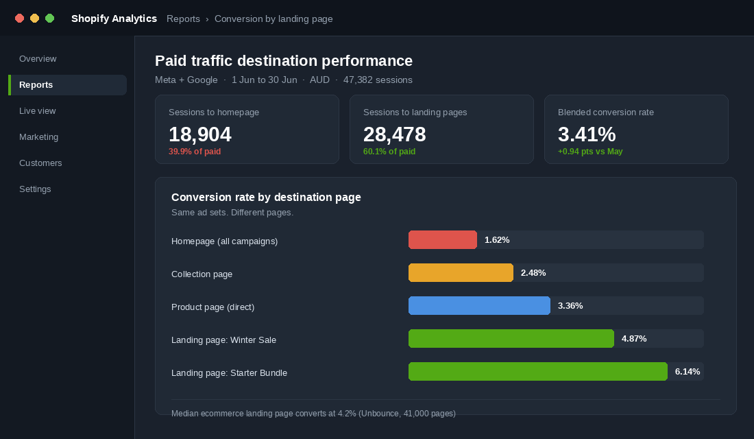
Before you build anything, pull this report for yourself. In Shopify Analytics, open Reports, then Sessions by landing page, and segment to paid sources only. Cross-reference conversion rate by destination. Nine times out of ten the homepage is quietly absorbing a third of your paid traffic and converting it at half the rate of everything else.
Part 2: Carry the Promise From the Ad to the Page, Word for Word
This is the part almost everyone gets wrong, and it is also the cheapest to fix. It is called message match: the headline a shopper reads on your page should repeat the promise that made them click, using close to the same words.
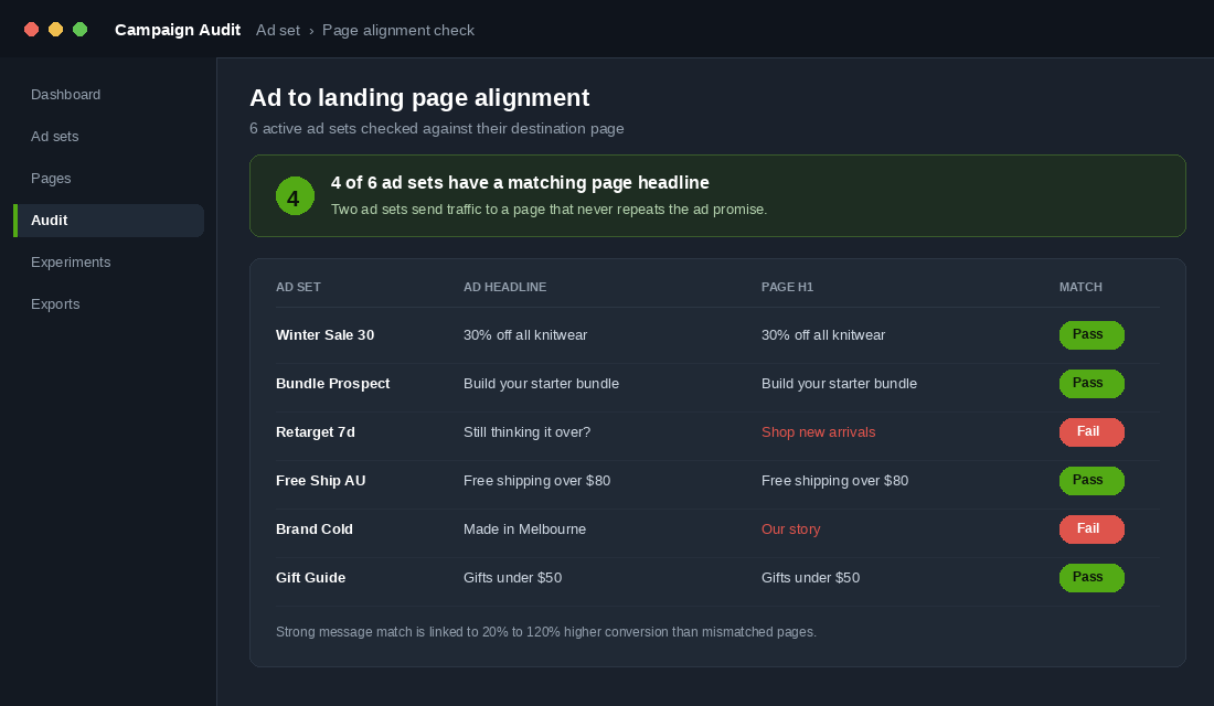
When a shopper clicks an ad saying “30% off all knitwear” and lands on a page headed “Shop new arrivals”, they have to do a small piece of mental work to confirm they are in the right place. Most will not bother. Pages with strong message match are associated with conversion lifts of 20% to 120% over mismatched equivalents, and a widely cited Moz case study recorded a conversion increase above 200% alongside a 69% drop in cost per conversion after fixing alignment alone.
The audit takes twenty minutes. Open a spreadsheet with four columns: ad set name, primary ad headline, the H1 on the destination page, and pass or fail.
Three rules make the fix stick:
- Repeat the offer figure exactly. If the ad says 30% off, the page says 30% off. Not “big savings inside”. Not “up to 40%”. The number the shopper is holding in their head has to appear above the fold.
- Reuse the creative. The hero image on the page should be the same product shot, or a near sibling, of the one in the ad. Visual continuity does the same job as headline continuity and takes no copywriting.
- Match the tone. A cheeky ad landing on a corporate page breaks the thread just as badly as a mismatched headline. Who Gives A Crap built a whole business on tone consistency, and their campaign work has produced results like a 44% surge in online sales and a 13% lift in new customer acquisition when the message ran cleanly end to end.
One practical note for Shopify. If you are running dynamic product ads, message match is largely handled for you because the ad shows the product and the click goes to that product. This is why your product pages need to be strong on their own. If yours have not had attention in a while, our Shopify Product Page Playbook covers the structure we use.
Part 3: Build the Page Around One Decision, Not One Product
A landing page has one job: move a shopper from “this looks relevant” to “I will buy this now”. Everything on the page either serves that decision or competes with it.
Koala is the example most Australian founders already know. Their approach was ruthless about this. A stripped-back menu, three selling points carried above the fold (best-reviewed, free delivery, 120-night trial), and no competing paths out of the page. The brand went from nothing to eight figures in its first year with that discipline as a core part of the model.
Here is the section order that works for cold Australian traffic. Build in this sequence and cut anything that does not fit.
- Hero. Headline that repeats the ad promise, one supporting line, one product image, one button. Nothing else.
- Proof strip. Review count and star rating, plus your two strongest trust signals. Free shipping threshold in AUD, returns window, and any local press or awards.
- The three reasons. Not nine features. Three benefits, each with an image and two lines of copy. This is where you answer “why this and not the cheaper one”.
- Objection block. Sizing, delivery timeframes to regional areas, whether it suits Australian conditions, what happens if it is wrong. Write the questions your customer service inbox actually receives.
- Social proof in depth. Three to five real reviews with names and photos. Reviews that mention the objection you just handled are worth ten generic five-star ratings.
- Offer and close. Restate the offer, restate the guarantee, one button. Same button copy as the hero.
Two things to remove that founders resist removing. The first is the full site navigation. Strip it to a logo and a cart. Every nav item is an invitation to leave the page you paid to send them to. The second is multiple offers. One page, one decision. If you want to sell the bundle and the single, that is two pages.
Worth knowing: category shifts the benchmark a lot. Unbounce’s data shows food and beverage landing pages converting at a 7.1% median while fashion and beauty sit around 1.3%. If you are in apparel, do not panic when your page converts at 2%. Compare yourself to your own homepage, not to a supplement brand.
Part 4: Build It Fast, Because Speed Is Part of the Conversion Rate
This is where a lot of landing page projects quietly lose the gain they just built. You design a beautiful page in a drag-and-drop builder, ship it, and hand back most of the conversion lift in load time.
The Google and Deloitte “Milliseconds Make Millions” study measured this across 37 brands. A 0.1 second improvement in mobile load time lifted retail conversions by 8.4% and average order value by 9.2%. Not one second. One tenth of a second. Now consider that published Lighthouse comparisons put native Shopify 2.0 sections around 87 on mobile, while pages built in some popular builders test in the 50s and 60s.
That gap is the difference between a page that wins and a page that breaks even.
Choosing your build method
- Native Shopify template (best performance). Duplicate your theme, create a new page template with only the sections you need, assign it to the page. Free, fastest, and requires either theme comfort or a couple of hours from a developer.
- Replo (best balance for paid traffic). Around 99 USD a month on the standard plan and the strongest performance profile of the major builders. Worth it if you are spending meaningfully on paid and iterating pages weekly.
- Shogun or PageFly (fine for evergreen pages). Cheaper entry points, larger mobile speed penalty. Better suited to content pages that are not carrying your ad budget.
If you take the native route, here is the setup. In your Shopify admin go to Online Store, then Themes, then Customise. Open the template dropdown at the top, choose Create template, base it on your default page template, and name it page.landing. Remove the header and footer sections, or use a header variant with no navigation. Add only the sections in the running order from Part 3. Then go to Pages, create your page, and set the template to page.landing in the sidebar.
Three build rules regardless of tool. Compress every image to WebP before upload and keep the hero under 200kb. Lazy load everything below the fold. And do not add a new app just for this page, because third-party scripts are the most common reason a landing page tests slower than the rest of the store. Our Shopify Site Speed Playbook goes deeper on auditing what is actually loading.
Part 5: Measure Per Page, Then Test One Thing at a Time
A landing page you cannot measure is a landing page you cannot improve. Most stores never separate landing page performance from sitewide performance, so the page gets built, launched, and never touched again.
Set up the measurement before you send traffic. In Google Analytics 4, create an exploration with landing page as the dimension and session conversion rate, sessions, and purchase revenue as metrics, filtered to paid medium. In Shopify, tag every campaign URL with consistent UTM parameters so the destination is unambiguous. Then track four numbers per page, weekly.
- Conversion rate. Your primary number. Compare to the destination it replaced, not to an industry average.
- Bounce or engagement rate. High bounce with good ad performance almost always means a message match problem, not a page design problem.
- Scroll depth to the offer block. If under half your visitors reach your closing offer, the page is too long or the proof section is not holding them.
- Average order value. A page can lift conversion and cut AOV if the offer pulls people to a cheaper entry product. Watch both together.
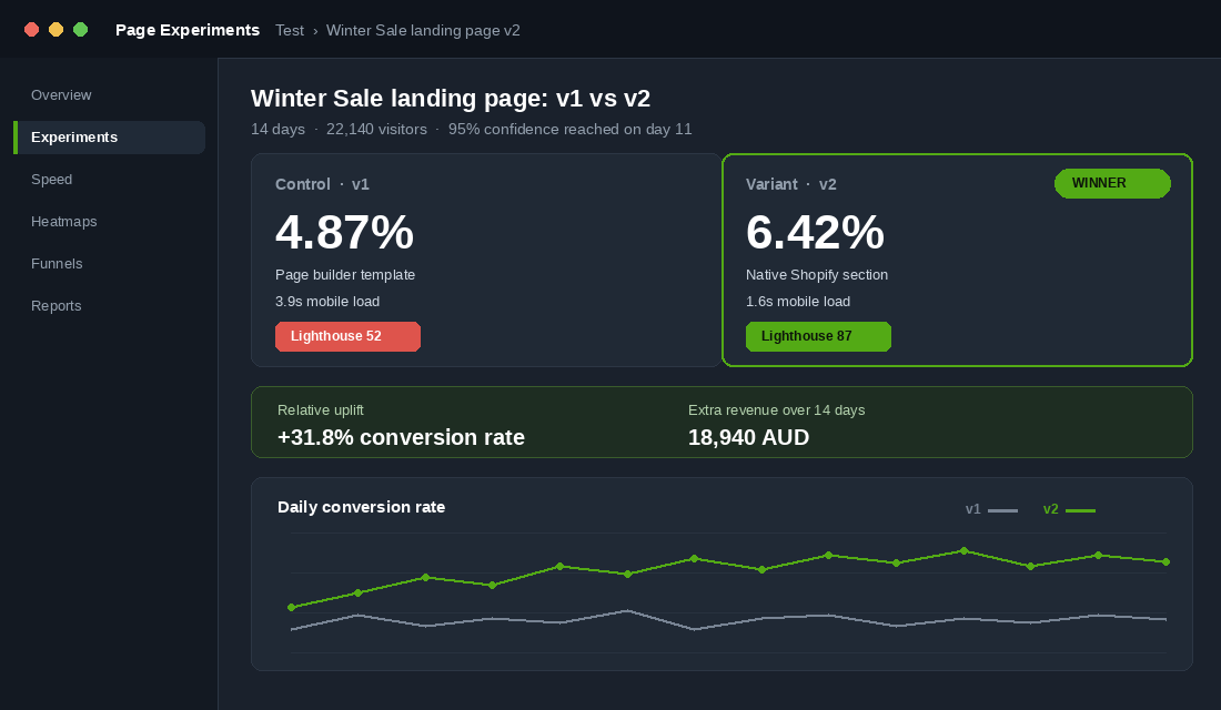
On testing, be realistic about volume. To detect a 20% relative lift with confidence you generally need a few thousand visitors and at least a couple of hundred conversions per variant. At 40k a month you might get one clean test per month. That is fine. One clean test beats four inconclusive ones.
Test in this order, because this is roughly the order of impact: the headline, then the offer framing, then the hero image, then the proof placement, then button copy. Never two at once. If both change and the page improves, you have learned nothing you can reuse.
How the Five Parts Compound
Taken individually, none of these five parts is dramatic. Together they multiply, and that is the point most operators miss.
Say you are running paid traffic to your homepage at 1.6%. You build a dedicated page for your top campaign and land at the 4.2% median. You fix message match and pick up a conservative 20%, taking you to roughly 5%. You rebuild natively instead of in a heavy builder and recover mobile speed, adding a few more percent. Then you run three clean tests over a quarter and find one winner worth 15%.
You have moved from 1.6% to somewhere near 6% on the same ad spend. That is not a 4.4 point improvement. It is roughly three and a half times the orders from an unchanged media budget, which changes what you can afford to pay for a click, which changes which audiences you can profitably reach.
This is the compounding that makes landing pages worth the effort. Every downstream lever gets easier when the page converts. Your email capture improves because more of the right people arrive, and if you are still capturing poorly, our Shopify Email Popup Playbook pairs well with this work.
Your Landing Page Build Checklist
Copy this into your project tool and work top to bottom. Nothing goes live until every box is ticked.
- Campaign passes at least two of the four qualifying tests from Part 1
- Page H1 repeats the ad headline promise, including the exact offer figure
- Hero image matches or closely echoes the ad creative
- Site navigation removed, logo and cart only
- One offer and one call to action, repeated with identical button copy
- Proof strip above the fold with review count and shipping threshold in AUD
- Three benefits, not a feature list
- Objection block written from real customer service questions
- Three to five named reviews, at least one addressing the main objection
- Hero image under 200kb, WebP, everything below the fold lazy loaded
- No new apps or scripts added for this page
- Mobile Lighthouse score checked and above 70
- UTM parameters set consistently across every ad pointing here
- GA4 exploration built with landing page dimension, filtered to paid
- Baseline recorded so you know what you are comparing against
- First test queued, one variable, headline first
Start with your single highest-spending campaign. Build one page properly, measure it against what it replaced, and only then build the second. Four well-maintained pages will outperform twenty neglected ones every time.
Inside eCommerce Circle, where your paid traffic lands is one of the first things we look at with every member, because it is usually the fastest available gain in the whole account. If you want a second opinion on yours, let’s talk.