You already know your conversion rate. Say it is 2.4%. You look at that number every morning, you argue about it in your weekly meeting, and you spend money trying to move it.
What’s in This Article
Here is the part almost nobody works on. That number means 976 out of every 1,000 people who landed on your store left without giving you a cent. You have detailed reporting on the 24 who bought. You have almost nothing on the 976 who did not.
Australians spent a record $82.6 billion online in 2025, up 14% year on year, across 9.8 million shopping households, according to the Australia Post eCommerce Report. The demand is there. If your store is converting at 2.4%, the problem is not that Australians have stopped buying. The problem is that a specific, nameable objection is stopping a specific group of people, and you have never asked them what it is.
Your Analytics Tell You What Happened, Never Why
Shopify Analytics, GA4 and your heatmap tool are all built on the same limitation. They record behaviour. They cannot record intent.
A session recording shows you someone scrolled to the size chart, went back up, hovered on add to cart for four seconds, then closed the tab. That is useful. It is also completely ambiguous. Did they leave because the size chart was confusing, because they wanted to measure themselves and come back, because the postage estimate spooked them, or because their toddler woke up?
Most operators fill that gap with a guess. Then they spend six weeks and a developer budget rebuilding a product page based on the guess. Sometimes it works. Usually it moves nothing, because the real objection was never on that page.
The Baymard Institute puts documented cart abandonment at 70.22% across a meta-analysis of more than 4,000 sites, and 48% of abandoners point to the same cause: extra costs like shipping, taxes and fees were too high. Mandatory account creation accounts for 24% and slow delivery for 23%. Notice that none of those three are design problems. You will not find them in a heatmap.
Step 1: Pick Which Non-Buyer You Are Actually Studying
This is where most survey attempts fall over. Operators drop one generic popup on the whole site, collect a soup of unrelated answers, and conclude that customer research does not work.
Non-buyers are not one group. They are at least four, and they have completely different reasons for leaving:
- The bouncer. Landed, looked, left within 15 seconds. Usually a traffic quality or message match problem, not a store problem.
- The browser. Viewed two or more products, never added to cart. This is where product page and category page objections live.
- The cart abandoner. Added to cart, never started checkout. Almost always price, postage or timing.
- The checkout abandoner. Started checkout, did not finish. Roughly 51.6% of checkout starts end this way. This group is the most valuable to interview because they were seconds from buying.
Pick one. Just one, for your first round. If you are under about 30,000 sessions a month, start with the browser or the cart abandoner, because that is where you will get enough volume to reach a conclusion inside a fortnight.
If you are already running post-purchase surveys, you have half the picture. Buyers tell you what convinced them. Non-buyers tell you what is costing you. You need both, and the second one is almost always more actionable.
Step 2: The Four Places to Catch a Non-Buyer Before They Vanish
You have a narrow window. Once someone closes the tab, they are gone and unreachable. These are the four capture points, ranked by how much signal they give you per response.
- Exit intent on product and cart pages. Fires when the cursor heads for the browser chrome, or on a mobile back gesture. Highest volume, and the objection is fresh in the person’s head.
- Time-on-page trigger. Fires after 45 to 60 seconds on a product page with no add to cart. Catches the hesitator rather than the skimmer, so the answers tend to be more considered.
- Abandoned cart email reply. Change the second email in your flow from a discount to a plain-text question: “Can I ask what stopped you?” Low volume, but the depth is unmatched. These read like interviews.
- Your inbox and DMs. Free, already happening, and almost nobody codes it. Every pre-sale question is a non-buyer telling you exactly what your site failed to answer.
Run the on-site survey and the email reply together. The on-site version gives you volume and rank order. The email replies give you the language customers actually use, which is what you will paste straight into your product copy later.
Step 3: Ask One Question, and Do Not Lead the Witness
One question. Not three, not a matrix, not a net promoter score. Popup surveys average a 3.65% response rate across SurveyMonkey’s platform data, and every extra field you add drags that down.
The question that works best is deliberately dull:
What stopped you from ordering today?
Now the part that separates useful research from expensive noise. Do not offer a tidy list of multiple-choice options on round one. The moment you write “Shipping was too expensive” as option A, you have told respondents what an acceptable answer looks like, and you will get a beautiful chart that confirms what you already believed.
Round one should be a free-text box. It is more work to analyse and it is worth it, because the answers you did not anticipate are the entire point of doing this.
Other rules that hold up in practice:
- Never attach a discount to the survey. The moment there is a code on the other side, you are measuring who wants a code.
- Do not ask for an email address on the same step. It converts a research tool into a lead capture form and halves your responses.
- Avoid the word “why”. “Why didn’t you buy?” reads as an accusation. “What stopped you?” reads as an invitation.
- Keep it to one line of copy. If the question needs a preamble, the question is wrong.
- Add an optional follow-up only after they answer. “Anything else we could have done?” as a second screen is fine. As a second field, it is not.
Step 4: Set the Survey Live in Under an Hour
Zigpoll and Grapevine Surveys both handle this well on Shopify, and both have free or low-cost tiers that are plenty for a first round. Hotjar works if you are already paying for it, though it is built for UX research rather than commerce. Fairing is excellent but it is a post-purchase tool, so it will not help you here.
Using Zigpoll as the example, this is the whole setup:
- Install from the Shopify App Store and let it add the theme app embed. Confirm the embed is toggled on under Online Store, Themes, Customise, App embeds.
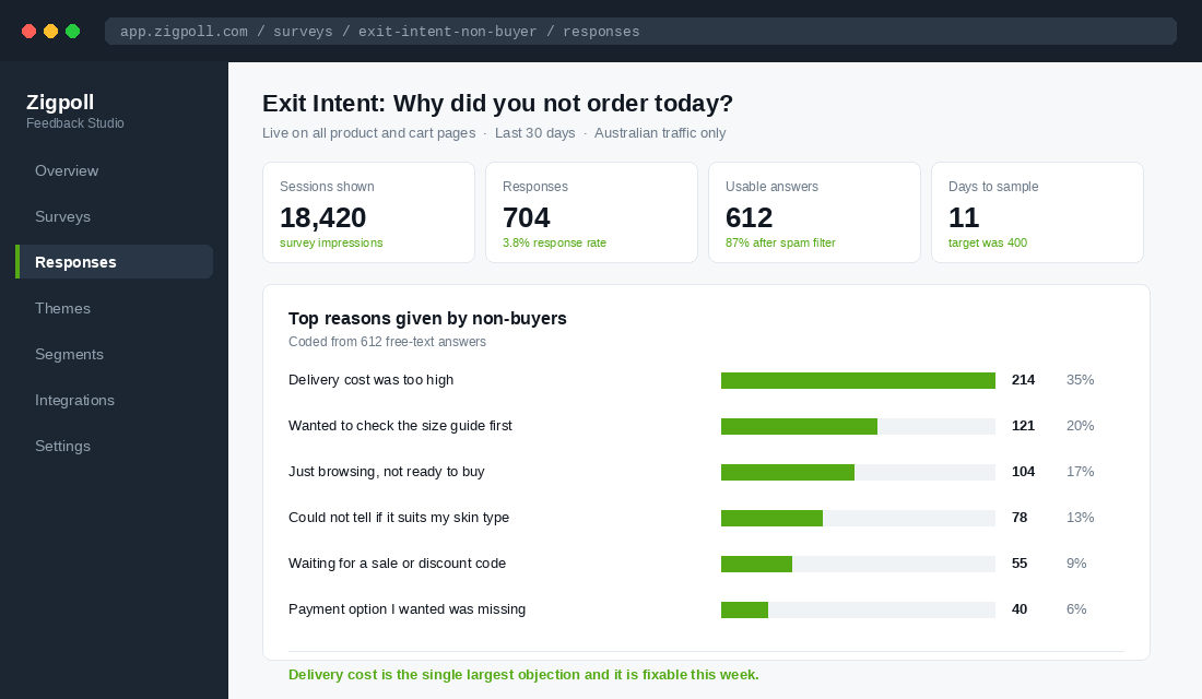
- Create a new survey, choose the on-site format, and set the question to “What stopped you from ordering today?” with an open text response.
- Set the trigger to exit intent, and add a secondary trigger at 60 seconds so you catch mobile users where exit intent is unreliable.
- Set page targeting to product pages and the cart page only. Exclude the homepage, blog and policy pages.
- Under audience rules, exclude anyone who has completed a purchase in the session, and cap display at once per visitor per 30 days.
- Set a response goal of 400 and a hard end date 21 days out, so the test cannot quietly run forever.
- Preview on your phone before publishing. Check that the survey does not cover the add to cart button on a small screen, because that is the one way this exercise can actively cost you money.
On roughly 18,000 product page sessions a month you should expect somewhere between 350 and 700 responses in the first fortnight. That is more than enough.
Step 5: Code the Answers Until the Themes Stop Changing
This is the step people skip, and skipping it is why most stores end up with a folder of survey exports nobody has read.
Export to a spreadsheet. Read the first 50 answers without labelling anything, just to get your ear in. Then start tagging each answer with a single theme. Not two, not “shipping and sizing”. One theme per answer, forced choice, because that is what makes the counts mean something.
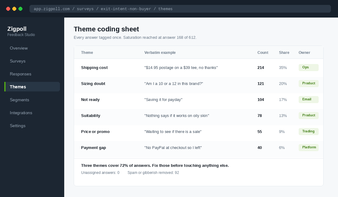
You are looking for saturation, the point where new answers stop producing new themes. Qualitative research consistently finds that roughly 90% of themes appear within the first 6 to 12 in-depth responses, and for short survey answers you will usually see it settle somewhere between 120 and 200. When you have read 40 in a row and created no new tag, you are done. Everything after that is confirming the size of the buckets, not discovering them.
A few practical notes. Delete gibberish and joke answers, but keep the angry ones, because frustrated customers are precise. Keep a verbatim example against every theme, word for word, typos included. That quote is worth more than the count when you come to rewrite the page.
Then sort by count. In almost every Australian store we look at, the top three themes account for 65% to 75% of all answers. That is your whole roadmap for the next quarter.
Step 6: Give Every Theme an Owner and a Fix
A theme with no owner is a note in a spreadsheet. Assign each one to a person and a specific surface on the site.
The mapping is usually more obvious than people expect:
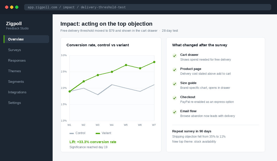
- Delivery cost. Do not immediately discount. First, state the cost earlier. 56% of Australian shoppers rank free delivery as their top delivery preference, so model a threshold instead of a blanket giveaway and show progress toward it in the cart drawer. Koala and The Iconic both lead with delivery and returns terms rather than burying them, and that is the pattern to copy.
- Sizing or fit doubt. Brand-specific measurements, not a generic AU size chart. Bared Footwear built a whole content approach around fit guidance for exactly this reason.
- Not ready or waiting for payday. This is not a site problem, it is a timing problem. Route it to your recovery flows and consider whether a buy now pay later option is genuinely missing.
- Suitability doubt. The customer cannot tell if the product works for their specific situation. Fix with a quiz, a comparison table, or better product page structure, not more adjectives.
- Payment gap. The cheapest fix on this list. Check what you have disabled at checkout and why.
Fix the top theme first and measure it on its own. If you change five things at once you will get a lift and you will never know which change earned it, which means you cannot repeat it on the next store, the next category, or the next season.
What to Do If You Do Not Have the Traffic Yet
If you are doing 5,000 sessions a month, an exit-intent survey will take you two months to reach 400 responses and the answers will be stale by the time you read them. Do not force it. Swap the method, keep the discipline.
Ten conversations will get you to the same place. Pull a list of everyone who abandoned a cart in the last 60 days and did not come back, and email them personally from your own address, not a marketing template. Something close to this:
Hi Sarah, I run the store and I noticed you had the merino crew in your cart last month but did not go ahead. No pitch and no discount, I promise. I am just trying to work out what we are getting wrong. Would you mind telling me what stopped you?
Send 40 of those. Expect 8 to 12 replies. That is inside the range where qualitative research reaches theme saturation, so it is a legitimate sample, not a consolation prize. The replies will be longer and richer than anything a popup produces, because you asked like a person rather than a widget.
Two things make or break this. Send from a real name and reply to every response within a day, even the harsh ones. A handful of those people will buy simply because you asked, which is a pleasant side effect but not the point.
Code the answers exactly the same way. One theme per reply, one verbatim quote per theme, ranked by count. Small sample, same method, same output.
The Compound Effect: A Loop, Not a Project
Here is what makes this different from every other conversion tactic you have tried. It does not run out.
When you fix the top objection, you do not arrive at a finished store. You promote the second objection into first place. Run the survey again in 90 days and the answers will have changed, because the population of people still leaving has changed. Shipping falls away and stock availability moves to the top. Fix that and sizing appears. Each pass is a smaller lift than the last, and each pass is compounding on a base that is already higher.
The secondary benefit is bigger than the conversion lift, and it is the one operators underrate. You end up with a running record of your customers’ objections in their own words. That record feeds your ad hooks, your email subject lines, your FAQ page, your packaging inserts, and the brief you hand to any agency. Most brands write their copy from what they wish were true. You would be writing yours from a spreadsheet of what 600 people actually said.
It matters more now than it did three years ago. The average Australian online basket dropped to $95 in 2025, down 2.1% and the lowest in a decade, while shoppers spread their spending across more brands. People are being deliberate. A deliberate shopper who leaves has a reason, and reasons can be answered.
The Two Listening Posts That Make Non-Buyer Research Ten Times Sharper
Exit surveys tell you what people say. Two other sources tell you what people do, and the strongest insights come from the places where all three agree.
Your site search log. This is the only place on your store where visitors type their intent in their own words, unprompted, with nothing leading them. Every zero-result search is a customer telling you that you do not stock something, or that you call it something they do not. Pull 90 days of search queries out of your search app or GA4 and sort by volume. If “returns” or “delivery time” are in your top 20 searches, your non-buyer problem is not price, it is that your policy pages are buried. We covered how to read and act on this in the Shopify site search playbook.
Competitor reviews. Your own reviews are written by people who bought, which makes them useless for understanding people who did not. Your competitors’ one and two-star reviews are the opposite. Those are written by people who had the objection, bought anyway, and were proved right. Pull 200 of them across your three closest competitors and code them exactly the way you code your survey answers. The overlap between “what non-buyers told me stopped them” and “what competitor customers complained about after the fact” is your positioning, handed to you for free. That process is laid out in the review mining playbook.
Run all three on the same coding sheet and the same theme names. When a theme appears in your exit survey, in your zero-result searches, and in competitor complaints, you are no longer guessing. You have triangulated it, and it goes to the top of the fix list regardless of how it ranks on raw count alone.
A rough weighting that works: a theme confirmed by two sources is worth roughly three times a theme confirmed by one, because single-source themes are far more likely to be an artefact of how you asked the question. If a theme shows up in only one source and it is your survey, run 100 more responses before you build anything expensive off it.
Time cost is small. Site search takes about 30 minutes a quarter once you know where the report lives. Review mining takes two to three hours for a proper first pass, then about 45 minutes a quarter to refresh. Both are cheaper than a single round of paid traffic aimed at a problem you have not diagnosed.
Your Non-Buyer Research Checklist
Print this, work through it once, and you will have more usable insight than a year of dashboard watching.
- Choose one non-buyer group. Bouncer, browser, cart abandoner or checkout abandoner. Not all four.
- Set a response target and an end date. 400 responses, 21 days maximum.
- Ask one open question. “What stopped you from ordering today?” No options, no discount, no email field.
- Trigger on exit intent plus 60 seconds. Product and cart pages only. Once per visitor per 30 days.
- Test on mobile before publishing. The survey must never cover the add to cart button.
- Code every answer to exactly one theme. Keep one verbatim quote per theme.
- Stop when you hit saturation. Forty answers with no new theme means you have your list.
- Rank by count and assign an owner. Top three themes only for this quarter.
- Fix one thing and measure it alone. Give it 28 days before you call it.
- Diary the repeat. Same survey, same settings, 90 days later.
The whole first round costs you an app subscription and about three hours of reading. Compare that against the cost of guessing wrong on a theme rebuild, and it is the highest return work available to most stores right now.
Inside eCommerce Circle, understanding your prospects properly is one of the core pillars we work on with every member, because almost every other decision gets easier once you know what your non-buyers are actually thinking. If you want a second opinion on yours, let’s talk.