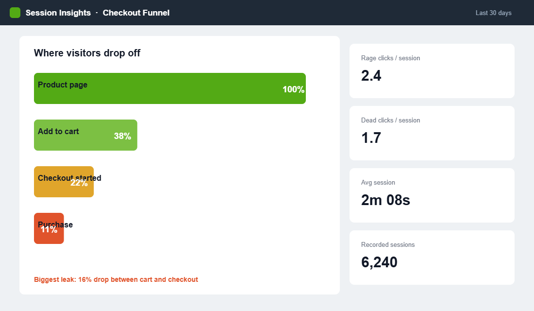
Your analytics can tell you that 68% of people leave your product page without adding to cart. It cannot tell you why. That gap is where most Aussie Shopify founders get stuck. They stare at a bounce rate, invent a theory, change the button colour, and hope. It is guessing dressed up as strategy.
What’s in This Article
Heatmaps and session recordings close that gap. They let you watch real customers move through your store: where they click, how far they scroll, where they hesitate, and the exact moment they give up. This is not a vanity exercise. Ecommerce teams that fix the friction they find in session replays typically recover 8 to 15% of lost revenue, and one UK store cut checkout abandonment from 25% to 4% after watching a single recurring problem play out on tape.
This playbook shows you how to set up behavioural tracking on Shopify for free, how to read what you see, and how to turn those observations into a prioritised list of fixes that actually lift conversion. No guessing required.
Analytics Tells You What. Heatmaps Tell You Why.
Google Analytics is brilliant at the what. Sessions, bounce rate, exit pages, conversion rate. It is a scoreboard. What it never shows you is the human on the other side of the screen tapping a product image that does not zoom, hunting for a size chart that is not there, or rage-clicking a promo code field that keeps rejecting their code.
That behaviour is where your lost sales actually live. A heatmap aggregates thousands of visits into a single visual: the hot zones people click and the cold zones they ignore. A session recording is the opposite lens, a play-by-play of one real visit. Used together, the heatmap tells you where to look and the recording tells you what went wrong. Roughly 70% of carts get abandoned across ecommerce, and most of those reasons are invisible in a standard analytics dashboard.
The Three Tools You Actually Need
You do not need an expensive stack. Three tools cover almost every situation, and you can start on the first one today at no cost.
- Microsoft Clarity. Free, unlimited sessions, no traffic caps, and a native Shopify integration. Its dashboard now surfaces ecommerce metrics like checkout abandonment, purchases, and most-viewed products, plus friction signals such as rage clicks and dead clicks. For most Aussie stores this is all you need to start.
- Hotjar. More polished, with a Funnels tool that maps drop-off step by step and built-in on-page surveys. Its session-based pricing climbs with traffic, so it suits growing stores that want deeper analysis.
- Mouseflow. Strong on friction scoring across large session volumes. One Danish skincare brand analysed over 450,000 sessions in Mouseflow, found its highest-friction pages, and shipped changes that delivered a 10% conversion uplift.
Start with Clarity because it is free and honest. Add Hotjar or Mouseflow later if you outgrow it. The tool matters far less than the habit of actually watching.
One caution: do not run three tools at once thinking more data is better. Overlapping scripts slow your store, and page speed is itself a conversion factor. Pick one, let it collect properly, and only add a second tool when you have a specific question the first one cannot answer.
Reading a Heatmap Without Fooling Yourself
A heatmap only helps if you know what each type is telling you. There are three you will use constantly.
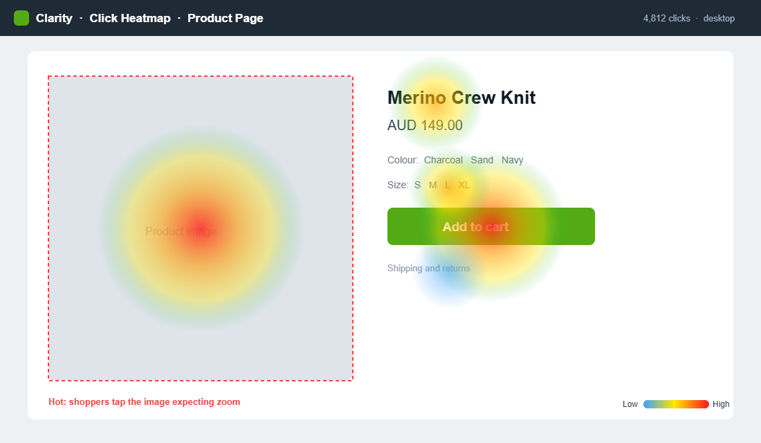
- Click maps. Show where people tap. The gold here is misplaced clicks: visitors tapping a product image expecting a zoom, or clicking a heading they think is a link. Those are unmet expectations you can fix in an afternoon.
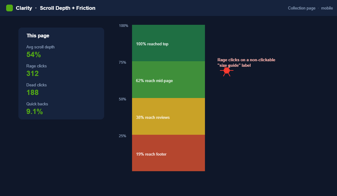
- Scroll maps. Show how far down the page people get. If 60% of visitors never reach your add-to-cart button or your reviews, the page order is wrong, not the content.
- Area maps. Aggregate attention across a section so you can see what earns the eye and what gets skipped entirely.
Two friction signals deserve special attention. A rage click is a rapid burst of taps on one spot, the digital version of jabbing a lift button that will not respond. A dead click is a tap on something that looks interactive but does nothing. Both point straight at a broken expectation, and both are flagged automatically in Clarity. Chase those first.
Session Recordings: Watch the Friction Happen
Heatmaps show you the pattern. Recordings show you the story. Watching ten real sessions of people trying to buy from you is worth more than a month of theorising, and it is usually uncomfortable, because you see exactly how confusing your store is to someone who did not build it.
Materials Market, a UK ecommerce store, used Hotjar recordings to work out why checkout was leaking. On tape, they watched visitors bounce when forced to create an account across several pages. They collapsed the flow into a single modal, reduced the steps, and changed the button from “Sign up” to “Secure Checkout”. Checkout abandonment fell from 25% to 4%. None of that was visible in analytics. All of it was obvious on the recordings.
When you watch, look for three things: hesitation (long pauses before an action), repetition (the same click or scroll over and over), and abandonment (the exact element on screen when they leave). Those three tell you where to point your next fix.
A practical rule: watch in batches of ten and stop to note what you saw before starting the next batch. Watching fifty in one sitting turns into a blur, and the details that matter get lost. Ten sessions, a few notes, repeat. Prioritise recordings that ended without a purchase, because a smooth successful visit teaches you far less than a frustrated one.
The Leaks a Heatmap Exposes First
Once you start watching, the same handful of problems show up again and again across Aussie Shopify stores. Knowing them in advance means you spot them faster.
- The image that will not zoom. Click maps light up on product photos because shoppers expect to tap and enlarge. If your theme does not support it, you are frustrating buyers at the exact moment they want a closer look.
- Hidden shipping and returns. Recordings show people scrolling up and down a product page hunting for delivery times and return terms. When they cannot find it fast, they leave to check a competitor and often do not come back.
- The discount code trap. A prominent promo field invites people to go hunting for a code they do not have. They open a new tab, get distracted, and never return to finish the order.
- Out-of-stock variants. Watch how many people select a colour or size, hit an unavailable variant, and give up rather than picking an alternative. That is recoverable revenue sitting in plain sight.
None of these show up as a line in your analytics. All of them show up in the first ten recordings you watch. That is the whole argument for doing this.
The Five Pages to Record First
You cannot watch everything, so start where the money is. Record these five in order and you will catch the bulk of your leaks.
- Product page. The highest-stakes page in your store. Watch for people hunting for sizing, shipping, or returns info that is buried or missing.
- Cart and slide cart. Look for surprise at shipping costs or confusion over discount codes. This is where intent quietly dies.
- Checkout. Even with Shopify’s optimised checkout, watch for form-field struggles and payment hesitation.
- Collection pages. See whether filters get used and whether people can actually find what they want.
- Homepage. Check that your hero and main navigation send people where you intend, not into a dead end.
Mobile deserves its own pass, because thumb behaviour is nothing like mouse behaviour. If most of your traffic is on a phone, filter your recordings to mobile only and watch those separately. Our mobile conversion playbook goes deeper on the specific fixes that matter there.
Set Up Microsoft Clarity on Shopify in 15 Minutes
There is no reason to put this off. Here is the fastest compliant way to get behavioural data flowing.
- Create a free Clarity account at clarity.microsoft.com and add a new project with your store URL.
- Connect it to Shopify. Clarity offers a direct Shopify integration, so you can link your store in a couple of clicks rather than editing theme code.
- Confirm masking is on. Clarity masks sensitive text by default so customer details are not recorded. Leave that on to stay aligned with the Australian Privacy Act.
- Wait 48 hours. Let real traffic build a meaningful sample before you draw any conclusions. Ten sessions is a hint, a few hundred is a signal.
- Set up your first segments. Filter to mobile visitors, to people who reached checkout, and to sessions with rage clicks. Those three views surface problems fast.
That is the entire setup. Fifteen minutes of work buys you a window into every visit from now on.
Get the Privacy Basics Right
Recording sessions means handling customer data, so treat it with care from day one. Under the Australian Privacy Act, you should be transparent about what you collect and avoid capturing sensitive personal information you do not need.
The good news is that the mainstream tools are built for this. Clarity and Hotjar both mask input fields by default, so names, addresses, and payment details are never recorded. Keep that masking on. Then do two simple things: mention behavioural analytics in your privacy policy, and make sure your cookie consent banner covers it. That is enough to run a clean, compliant program while still seeing everything you need about how people navigate the store.
Australian shoppers are increasingly privacy-aware, and getting this right is not just a legal box to tick. It protects the trust that makes them buy from you in the first place.
Turn Observations Into a Test Backlog
Watching is only half the job. The founders who get results treat every insight as a hypothesis and log it. When Totally Promotional could not work out why a new range of custom pens was not selling, recordings showed visitors did not understand the order process and left. They rewrote the order form, cleared up the confusion, and pen purchases rose 300%.
Build a simple backlog with four columns: what you observed, the page, your hypothesis, and the expected impact. Then rank by impact against effort. A dead click on your PDP that takes ten minutes to fix beats a homepage redesign that takes three weeks. Pair the behavioural evidence with what customers tell you directly in a post-purchase survey and you get both the what and the why in one place.
Where you have the traffic to run a proper test, validate the change before you commit. Where you do not, ship the obvious fixes and watch the recordings again in a fortnight to confirm the behaviour actually improved.
The Mistakes That Waste a Heatmap Setup
Plenty of founders install a tool, glance at it once, and never open it again. Two mistakes cause most of that waste.
The first is acting on too little data. Ten sessions can spark a hypothesis, but they cannot confirm one. Wait for a few hundred sessions on a page before you conclude a pattern is real, or you will chase noise and ship changes that do nothing. Behaviour that looks like a trend in five clips often evaporates across three hundred.
The second is watching without deciding. Observation that does not end in a logged hypothesis and a ranked fix is just entertainment. Every session you watch should produce either a note for the backlog or a confident “this page is fine”. If you are not writing anything down, you are not doing CRO, you are just watching telly with extra steps.
The Compound Effect of a Weekly Watching Habit
The brands that win with this do not run one heatmap audit and move on. They block 30 minutes every week to watch ten fresh recordings. It sounds small, and that is the point. Each week you catch one more leak, ship one more fix, and confirm one more assumption against reality instead of opinion.
Over a quarter, that habit compounds into a store that fits how your customers actually behave rather than how you imagine they do. It also sharpens every other decision you make, because you are reading real behaviour instead of arguing about hunches. Layer it alongside your retention view, like the one in our cohort analysis playbook, and you are optimising both the front door and the return visit.
There is a quieter benefit too. When your team argues about a design change, the recordings settle it. Instead of the loudest opinion winning, you pull up ten sessions and let real customers cast the deciding vote. That single shift, from opinion to evidence, is what separates stores that plateau from stores that keep climbing.
A 30-Day Rollout You Can Actually Follow
Big audits stall because they feel like a project. Break it into four weeks and it becomes a routine you finish.
- Week one: install and let it run. Connect Clarity to Shopify, confirm masking, and do nothing else. Let real traffic build a sample while you resist the urge to draw conclusions from a handful of sessions.
- Week two: audit the money pages. Review click, scroll, and area maps on your product page, cart, and checkout. Filter for rage clicks and dead clicks first. Log every observation, do not fix anything yet.
- Week three: ship the obvious wins. Take the top three high-impact, low-effort fixes off your backlog and implement them. A missing size chart, an image that will not zoom, a confusing checkout step. Fast fixes, real gains.
- Week four: verify and repeat. Watch fresh recordings of the pages you changed. Did the behaviour improve? Confirm the win, then set your recurring weekly 30-minute slot and keep the loop turning.
By the end of a month you have a compliant setup, a working backlog, and at least three shipped improvements grounded in real behaviour rather than a hunch. That is more conversion progress than most stores make in a quarter of redesigns.
Segment Your Recordings or You Will Fix the Wrong Page
An aggregate heatmap is an average of people who behave nothing like each other. A first-time visitor from a cold Meta ad and a returning customer who came from your welcome email are running completely different errands on the same page, and blending them produces a picture that describes neither.
Four segments do most of the work, and all four are available in Microsoft Clarity for free. Watch them separately and the leaks separate themselves.
- Mobile, new, paid traffic. Usually 55-70% of your sessions and almost always your worst converting group. Start here. If you only ever watch one segment, watch this one.
- Desktop, returning. Your highest intent. When these people hesitate, it is a trust or logistics question — shipping, returns, sizing — not a design question.
- Sessions with rage clicks or dead clicks. Clarity flags these automatically. Ten of these recordings will find more real bugs than two hours of general browsing.
- Sessions that reached cart but not checkout. The most expensive drop-off in the funnel, and the one where recordings beat analytics most decisively.
Watch 8-12 recordings per segment before you draw a conclusion. Under about eight you are pattern-matching on noise, and past about fifteen you stop learning anything new. If the same friction appears in three of ten sessions, that is roughly 30% of that segment hitting it, which is more than enough to justify a fix.
Two traps to avoid. Do not watch your own sessions or your team’s, so filter your office IP out on day one. And do not judge a page from recordings taken during a sale, because discount-driven behaviour is not your baseline. If the cart-to-checkout segment is where your leak sits, pair what you see with the recovery mechanics in our abandoned cart recovery playbook.
From Observation to Hypothesis: Sizing a Fix Before You Build It
Watching is the easy part. The discipline that separates a useful heatmap habit from an expensive one is refusing to build anything until you have written down what you expect it to be worth.
Write every observation in the same four-part form: on this page, this segment does this, which costs us this, so we will change this. “On mobile product pages, new paid visitors scroll past the size guide link 80% of the time, which we believe drives our 6% size-related return rate, so we will move the size guide above the add-to-cart button.” That sentence is testable. “The size guide needs work” is not.
Then size it before you queue it, using numbers you already have in GA4. Take the sessions hitting that page per month, multiply by the share in the affected segment, multiply by a conservative conversion lift, and multiply by average order value. Be deliberately pessimistic: assume a 5-10% relative lift on the step you are fixing, not on site-wide conversion rate.
A worked example. Your product page takes 12,000 sessions a month, 65% are mobile, the page converts at 2.4%, and your AOV is $95. A 7% relative lift on the mobile portion is roughly 13 extra orders a month, or about $1,235 in revenue. That is a half-day theme change, not a redesign, and now you can rank it honestly against everything else on the list.
- Do it this week: estimated value above $500 a month and under two hours of work. Broken links, mis-sized tap targets, a form field that fails silently. Ship these without testing.
- Test it properly: above $1,000 a month but requires a real layout or copy change. Needs a before-and-after window or a split test.
- Park it: anything you cannot size. If you cannot put a number on it, you do not understand the problem well enough to fix it yet.
Measuring the result is where most stores let it slip. You need a minimum of 250-300 conversions per variant before a result means anything, which for most Aussie stores is two to four weeks, not two days. Anything shorter and you are reading noise and calling it a win.
Finally, judge the outcome on revenue per visitor rather than conversion rate alone. A change that lifts conversion by 8% while dropping average order value by 12% has cost you money, and conversion rate on its own will happily hide that. The framework for tracking it is in our profit per visitor guide, and if you want the direct answer to why someone hesitated rather than an inference from a recording, pair your watching habit with the post-purchase survey playbook.
Your Heatmap Audit Checklist
Run this the first week, then keep the weekly habit going:
- Install. Microsoft Clarity connected to Shopify, masking confirmed on, 48 hours of data collected.
- Heatmaps. Click, scroll, and area maps reviewed on your top five pages, misplaced clicks and short scroll depth noted.
- Friction. Rage clicks and dead clicks filtered and watched first.
- Recordings. Ten sessions each for product page, cart, and checkout, on both desktop and mobile.
- Backlog. Every observation logged with page, hypothesis, and impact, then ranked by impact over effort.
- Habit. Thirty minutes booked weekly to watch ten fresh sessions and reconfirm your fixes worked.
Inside eCommerce Circle, reading real customer behaviour before touching the site is one of the core Performance pillars we work on with every member. If you want a second opinion on where your store is leaking, let’s talk.