Most Shopify founders never think about variant architecture. You add a product, you type in the sizes and colours you sell, you hit save. Three years later you have 1,800 SKUs, a product page that loads a dropdown nobody opens, half your Google Shopping feed sitting in disapproved, and a conversion rate that has been drifting down for six months without an obvious cause.
What’s in This Article
Here is the part that stings. The way you structure product options is one of the highest-return technical decisions on your store, and it is almost never audited. It controls whether a shopper can find their size in one tap or three. It controls whether a sold-out colour kills the page or quietly steps aside. It decides how Google groups your products, which pages rank, and how many of your listings are eligible for free listings at all.
The numbers behind this are brutal. Bidnamic’s analysis of retail stock data found conversion rate drops by roughly 30% when a product’s availability falls from 100% to 75%, and when availability drops to 10% the conversion rate is half what it is at 60% availability. That is not a stock problem. That is an architecture problem, because the shopper is landing on a page where the option they want is greyed out and the page gives them nowhere to go.
I have sat with hundreds of Aussie Shopify founders on this exact issue. Below are the six rules we work through. Run them on your top 20 products this week and you will find revenue you did not know you were leaving on the table.
Rule 1: Decide what is a variant and what is a separate product
This is the decision everything else hangs off, and most stores get it wrong by default because Shopify’s admin nudges you toward cramming everything into one product.
The test is simple. Ask: would a shopper searching Google use different words for these two things? If yes, they are separate products. If no, they are variants of one product.
- Size is almost always a variant. Nobody searches “linen sheet set queen” as a fundamentally different intent to “linen sheet set king”. Same product, same story, same reviews.
- Colour is the grey zone. “Sage green linen sheets” is a genuine search with genuine volume. If your colours have their own demand, own photography and own seasonality, they earn their own URL.
- Material, capacity and format are usually separate products. A 500ml bottle and a 2L bottle solve different jobs, have different price points and different reorder cycles.
- Bundles are always separate products. Never make “3-pack” a size option. It wrecks your average order value reporting and your inventory maths.
Look at how the Australian luggage brand July handles this. Suitcase sizes (Carry On, Checked) sit as separate product pages with their own copy, own reviews and own search intent, while the colour range lives as swatches inside each one. That split matches how people actually shop: you pick the size that fits your trip, then you pick the colour you like.
Contrast that with linen bedding brands like Cultiver, where a single product line spans a dozen colours across five bed sizes across two weights. That is a genuine matrix, and it needs a genuine architecture decision, not a default.
Rule 2: Know your ceilings before you design the matrix
Shopify raised the product variant limit from 100 to 2,048 variants per product, and as of 15 October 2025 that applies across every plan, not just Plus. That was a genuinely big change and a lot of stores still have workarounds in place that no longer need to exist.
What did not change is the harder constraint: you still get a maximum of 3 options per product, and a maximum of 250 media files per product. So you can now do 16 colours by 8 sizes by 16 lengths in one listing. You still cannot do Colour, Size, Length and Monogram in one listing, because that is four options.
Three practical implications for an Aussie operator:
- If you built ugly workarounds under the 100-variant cap, revisit them. Products split into “Part A” and “Part B” listings purely to dodge the old limit are now costing you consolidated reviews and consolidated link equity for no reason.
- Reserve your third option slot deliberately. Personalisation, engraving and monogramming should be handled by line item properties or a product options app, not by burning an option slot you will want later.
- Watch the media ceiling. 250 files sounds generous until you have 16 colours at 6 images each plus video. At that point splitting colours into separate products stops being an SEO decision and becomes a technical one.
Write the matrix out in a spreadsheet before you build it in Shopify. Colours down the side, sizes across the top, and a count in the corner. If the count is over a few hundred, you need a plan for how sold-out cells behave, which is the next rule.
Rule 3: Treat variant availability as a conversion metric, not a warehouse metric
This is the single most valuable idea in this article, so slow down here.
Most founders track stock as an operations number. How many units on hand, when do we reorder. What they do not track is variant availability: the percentage of variants on a product that a shopper can actually buy right now.
The most popular variants sell out first. Medium and large in menswear. Queen in bedding. The 8 and 10 in womenswear. So the shopper who arrives with the highest purchase intent is the one most likely to hit a greyed-out button. Worse, when a few sizes are gone, shoppers read the whole page as “this brand does not have my stuff” and leave, which is why conversion falls faster than availability does.
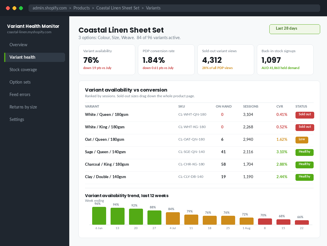
Build this as a weekly number. Pull your variant list, count how many have inventory above zero, divide by total variants. Do it per product for your top 20 and as a store-wide average. Then set a rule:
- Above 85% availability: healthy. Keep advertising the product normally.
- 70% to 85%: warning. Pull the product out of your top-of-funnel Meta and Google Shopping campaigns, or you are paying to send traffic to disappointment.
- Below 70%: intervene. Either restock, or restructure the listing so the available options lead, or move the product off the homepage.
The recovery mechanic matters as much as the metric. Every sold-out variant should capture demand rather than lose it. A back-in-stock signup on a queen sheet set is worth AUD 249 of held demand, not nothing. If you have not set that up properly, our back in stock playbook walks through the full notification architecture.
Rule 4: Expose the options, never hide them in a dropdown
Baymard Institute’s usability research is unambiguous on this. Instead of using a drop-down with the size options hidden by default, sites should expose the size options using button-style selectors so shoppers can see these crucial variations without a tap.
The reason is not aesthetics. A hidden dropdown makes a shopper spend a click to learn bad news. They tap, they scan, they find their size is gone, and now they have invested effort for a negative result. Exposed buttons deliver the same information for free, and if their size is available they are one tap from the cart instead of three.
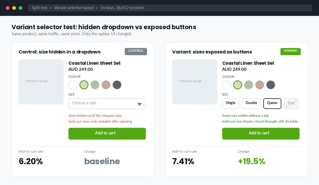
What good looks like on a Shopify product page:
- Sizes as buttons, always visible, never a select element. On mobile they should wrap onto two lines rather than scroll horizontally.
- Colours as real swatches showing the actual colour or fabric, not text labels. A shopper choosing “Oat” versus “Clay” cannot do that from words.
- Sold-out options shown, struck through, and still clickable. Clicking should trigger the back-in-stock form, not a dead end. Hiding sold-out sizes is worse than showing them, because the shopper cannot tell whether you never made their size or you sold out of it.
- The main image updates when the colour changes. Baymard found 54% of ecommerce sites fail to make thumbnails reflect the colour variation the user is looking for, and they name site abandonment as a direct result.
- The size guide sits next to the size selector, not buried in a tab at the bottom. Australian sizing confuses international shoppers and AU 10 is not US 10.
This last point is where variant architecture meets your returns line. Apparel return rates run 20% to 40%, and McKinsey’s work puts around 70% of fashion returns down to sizing. Bracketing, where a shopper orders two or three sizes intending to send most back, now accounts for an estimated 30% to 40% of clothing returns. Every one of those returns started as a variant selection the shopper was not confident about.
Bared Footwear is a good Australian example of taking this seriously. They run European sizing with roughly half-centimetre increments, publish a measure-your-foot guide rather than a bare conversion table, and offer virtual fittings with a team available seven days a week. That is variant confidence built into the buying process rather than bolted on afterwards. If your size guide is a screenshot of a table, start with our size guide playbook.
Rule 5: Name your options once, and name them properly
Open your Shopify admin, filter products, and look at your option names across the catalogue. Most stores find some version of this mess: “Colour” on some products and “Color” on others. “Size” here, “Sizing” there. “Sml” and “Small” and “S” all in the same collection.
Inconsistent option naming breaks three things at once, and none of them announce themselves.
- Collection filters fragment. Shopify builds filters from option names, so “Colour” and “Color” become two separate filter groups and your shopper sees a broken sidebar.
- Metaobject swatches fail silently. If you map a swatch to the value “Sage” and one product uses “Sage Green”, that product renders a plain text button while everything else renders a swatch.
- Your product feed inherits the mess and Google starts rejecting items on attribute mismatch.
Fix it with a written standard, then enforce it. The standard should specify: option names in Australian English (Colour, Size, Material), size values in one system per category, and colour values as a fixed named palette that maps one-to-one to your metaobject swatches. Document it in the same place your product data rules live. If you have not built that layer yet, the product data playbook is the place to start.
One more naming rule that pays immediately: your SKU should encode the variant, not just the product. CL-WHT-QN-180 tells a picker in a Melbourne warehouse exactly what to grab. CL-00042 tells them nothing, and every mispick is a return you paid for twice.
Rule 6: Make the feed match the storefront
Your storefront and your Google Merchant Center feed have to agree about what a variant is, and for most stores they quietly do not.
Google’s requirement is specific. Every variant of the same product must share the same item_group_id value, each variant needs its own unique ID, and each must carry at least one variant-identifying attribute such as colour, size, material or pattern. For apparel and accessories, colour and size are not optional. Size is required for free listings across Clothing and Shoes, and multiple sizes must never be submitted comma-separated in one field.
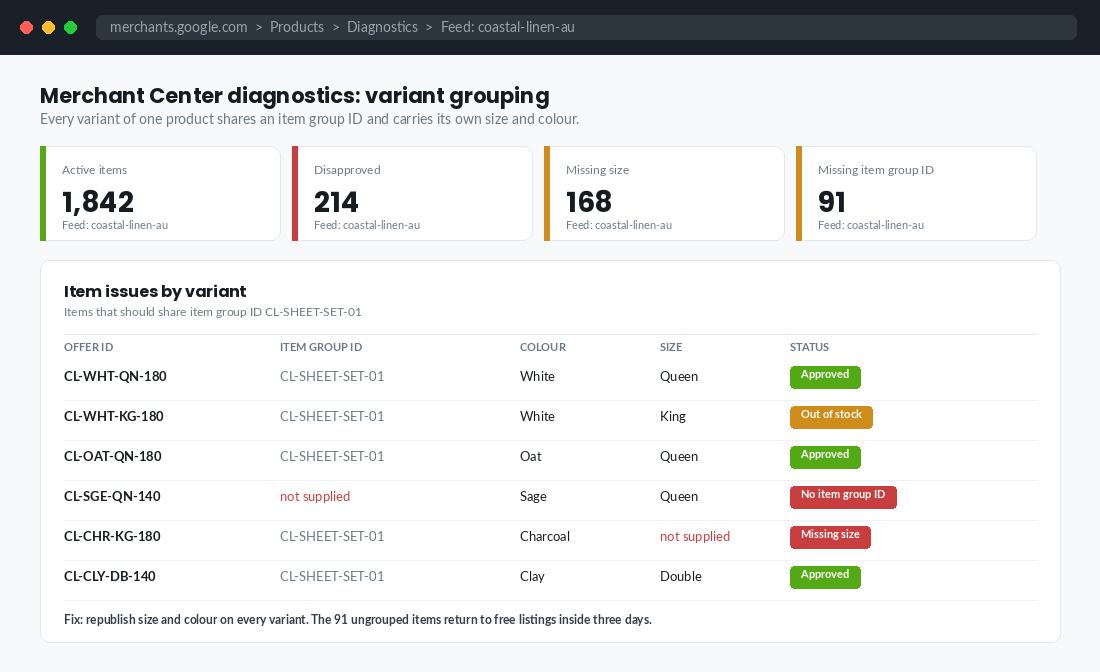
What breaks in the real world:
- Colour split into separate Shopify products with no shared item group ID. Google treats them as five unrelated products, splits your performance data five ways, and you lose the variant carousel in Shopping results.
- Size stored in the product title instead of an option. Feeds cannot parse it, so the size attribute comes through empty and apparel items get disapproved.
- Out-of-stock variants left live in the feed. You pay for the click, the shopper lands on a greyed-out button, and you have bought a bounce.
Audit this monthly in Merchant Center under Products then Diagnostics, filtered by item issue. Missing size and missing item group ID are the two to chase first, because both are fixed in Shopify rather than in the feed. Our Google Shopping feed playbook covers the full attribute mapping.
The tools: Search & Discovery, and Combined Listings
Two tools do most of the work here, and one of them is free.
Shopify Search & Discovery (free, every plan)
This is the app that turns your variant options into collection filters. Setup takes about twenty minutes:
- Install Search & Discovery from the Shopify App Store and open it from your admin sidebar.
- Go to Filters. Shopify lists every product option and metafield it can filter on, with a count of how many products use each.
- That count is your naming audit. If you see “Colour (412)” and “Color (38)”, you just found 38 products to fix before you go further.
- Add filters for Availability, Colour, Size and Price. Set Availability to appear first so shoppers can hide sold-out items in one tap.
- Rename filter labels to shopper language. “Size” beats “Option 2” every time.
- Open a collection on mobile and check the filter drawer. If a filter shows more than about a dozen values, your naming needs consolidating, not more filters.
Filters are the fastest lever on a large catalogue. If your collection pages are still a wall of products with no way to narrow down, start with our collection filtering playbook.
Combined Listings (Shopify Plus, or a third-party equivalent)
Combined Listings solves the colour dilemma properly. It links separate products, each representing one colour or material, and displays them together on a single product page connected by a shared option. The shopper clicks a swatch and the page updates with that product’s own images, title and URL.
The experience feels like variants. The SEO works like separate products, because each colour keeps its own URL, title, description and images, and each appears in your Google Shopping feed as its own item with its own image and availability. That is the best of both structures, and it is why the “should colour be a variant” argument finally has a decent answer.
Native Combined Listings is a Plus feature. If you are on Basic, Grow or Advanced, third-party apps replicate the pattern, so test one on a single product line before rolling it out across the catalogue.
How the six rules compound
Individually these look like housekeeping. Together they change the economics of your catalogue, because each one multiplies the next.
Clean option naming makes filters work. Working filters mean shoppers reach a product page where their size actually exists, which lifts the conversion rate on the traffic you already pay for. Exposed buttons mean they see availability instantly instead of tapping into disappointment, and a proper size guide next to those buttons means fewer of them order two sizes to be safe. Fewer bracketed orders means a lower return rate, which means better contribution margin on the same revenue.
Meanwhile the same clean option data flows into your feed, so more items stay approved, more variants stay eligible for free listings, and your Shopping campaigns stop paying for clicks into sold-out sizes. Tracking variant availability weekly means you catch the drift before the conversion rate does, and the back-in-stock captures hold demand rather than losing it to a competitor.
That is the compound effect. One structural decision, made properly, shows up in conversion rate, in return rate, in ad efficiency and in organic visibility at the same time. Very few things on a Shopify store do that.
What Variant Sprawl Actually Costs You in Working Capital
Every rule above is framed as a conversion problem, because that is where founders feel it first. But variant sprawl bills you twice. The second bill lands in your bank account, and it is usually the bigger one.
Here is the arithmetic. A tee in 5 sizes and 4 colours is 20 SKUs. Add a second fit and you are at 40. If your minimum order quantity is 50 units per SKU and your landed cost is $14 AUD, that matrix has just committed $28,000 AUD of cash before a single unit sells. Widen the range by one more colour and you have added $3,500 AUD to the order, but you have not added a single new customer.
The pattern is remarkably consistent across the catalogues we pull apart. In most Aussie apparel and homewares stores, the top 20% of variants drive somewhere between 70% and 80% of units sold. The bottom 30% of variants often account for under 5%. Those bottom variants are not neutral. They carry a real annual holding cost of roughly 20-30% of their landed value once you count storage, capital, shrinkage and eventual markdown.
Run this in Shopify admin in about fifteen minutes. Export Analytics > Reports > Sales by product variant SKU for the last 12 months. Sort by units sold ascending. Then look at the bottom third and ask three questions of each row:
- Did it sell more than 12 units in 12 months? Under one unit a month, it is a display item, not a product line.
- Is it the only reason a customer converts? An XXL that sells 8 units a year but is the only size a whole segment can wear is worth keeping. A fifth shade of grey is not.
- What is its sell-through at week 12 of a season? Below 40% and you are already looking at a markdown, so budget for it now rather than discovering it in January.
Cutting the tail is not just a cash exercise. Fewer variants means a shorter option list, faster feed processing, cleaner filtering and fewer sold-out states for shoppers to trip over. The conversion win and the cash win come from the same decision, which is rare enough to be worth acting on. If you want the full method rather than the fifteen-minute version, our SKU rationalisation playbook walks the five-tier portfolio audit, and the inventory forecasting playbook covers how to set reorder quantities once the matrix is trimmed.
One warning before you start deleting. Never remove a variant that has search demand or existing inbound links. Set it to unavailable, keep the URL alive, and let the back-in-stock capture do its job. Deleting variant URLs at scale is one of the fastest ways to lose organic traffic you spent two years earning.
The 390-Pixel Test: What Your Options Look Like on the Screen That Actually Buys
Roughly 70-80% of Australian ecommerce sessions now arrive on mobile. Yet almost every variant matrix gets designed on a 27-inch monitor, where 24 swatches sit in a tidy grid and nothing wraps. On a 390-pixel iPhone viewport, that same grid becomes six rows of taps between the shopper and the buy button.
Open your best-selling product on your own phone and time it. From landing on the page, how many seconds until the correct size and colour are selected and the add-to-cart button is visible without scrolling back up? If the answer is more than about eight seconds, your variant layout is costing you orders.
Four things to check on the small screen:
- Tap target size. Swatches and size pills need at least 44 x 44 CSS pixels. Anything smaller produces mis-taps, and a mis-tap on a variant selector often means the shopper adds the wrong size and returns it later.
- Selection state clarity. A 1-pixel border is not a selection state on a phone in daylight. Use a filled background or a clear ring, and never rely on colour alone.
- Where the price sits. If price updates when a variant changes, it must stay in view. A shopper who taps a size and cannot see whether the price moved will hesitate, and hesitation on mobile means a back tap.
- Cumulative layout shift. Variant images that swap in without reserved space push the buy button down mid-tap. Keep CLS under 0.1. This is one of the more common causes of the mystery “they nearly bought” session.
Do not guess at any of this. Record 20 mobile sessions on your top product page in Microsoft Clarity, which is free, or Hotjar if you already run it. Filter to sessions with a rage click or a dead click on the product page and watch them end to end. You will find the pattern inside half an hour, and it is almost never the thing you expected.
Then check the page weight underneath it all. Variant swatch images, size charts and colour metafields quietly add requests, and a product page that takes over 2.5 seconds to reach largest contentful paint on a mid-range Android will lose shoppers before the variant selector even renders. Our speed optimisation playbook covers the seven levers that move mobile LCP, and the size and fit playbook deals with the sizing confidence problem the swatches cannot solve on their own.
The 30-minute variant audit
Block half an hour this week and run this on your top 20 products by revenue. Score each line yes or no.
- Structure. Does each option earn its slot, or is something in there (bundle, pack size, personalisation) that should be a separate product or a line item property?
- Ceilings. Are you under 3 options and 250 media files, and are any old workarounds from the 100-variant era still in place?
- Availability. What percentage of variants on each product are buyable right now? Flag anything under 85%.
- Exposure. Are sizes rendered as visible buttons, not a dropdown? Are colours real swatches? Does the hero image change with the swatch?
- Sold-out behaviour. Are sold-out options visible, struck through and clickable into a back-in-stock capture?
- Naming. One spelling of Colour, one size system per category, one colour palette mapped to swatches, across every product.
- SKU. Does the SKU encode product, colour, size and any third option in a readable pattern?
- Feed. In Merchant Center diagnostics, how many items are flagged for missing size or missing item group ID?
- Size guide. Is it beside the selector, does it use centimetres, and does it explain Australian sizing to overseas buyers?
- Filters. Do Availability, Colour and Size all appear as filters on your main collections, on mobile?
Anything scoring under seven out of ten is costing you money right now. Fix the naming first, because everything else depends on it. Then availability, because that is where the conversion rate is leaking. Then exposure, then the feed.
None of this is glamorous work. It is also the reason two stores selling the same product at the same price, spending the same on ads, can end up with conversion rates a full percentage point apart. The one that wins is not the one with better creative. It is the one where the shopper found their size in one tap and believed it would fit. If your product page still has work to do beyond variants, our PDP conversion playbook covers the rest of the page.
Inside eCommerce Circle, variant architecture is one of the first things we pull apart with every member, because it is usually the cheapest fix on the whole store. If you want a second opinion on yours, let’s talk.