Most Shopify stores trying to lift conversion rate start with a button colour. They test green against orange for three weeks, get a result nobody trusts, and move on. Meanwhile the real leak, a product page that never answers the delivery question, keeps costing them orders every day.
What’s in This Article
A CRO audit fixes that order of operations. Before you test anything, you find where buyers actually drop out, put a number on each leak, and fix the biggest ones first. Done properly it takes one focused afternoon, and it is the cheapest conversion work you will ever do because it needs no traffic, no agency and no testing tool.
Here is the thing most guides skip. Baymard Institute has pulled together 50 studies and puts the average documented cart abandonment rate at 70.22%. Its own research estimates that fixing the checkout usability problems it has documented could lift the average large ecommerce site’s conversion rate by 35.26%. Those are Baymard’s estimates, not guarantees, but the direction is clear: most of the upside sits in problems you can already see, not in clever new ideas.
This is the 10-point checklist we run with stores inside eCommerce Circle. Each check tells you what to look at, what good looks like, and what to do if you fail it. At the end there is a scoresheet you can copy and a simple rule for deciding what to fix first.
What a CRO audit is (and what it is not)
A CRO audit is a structured review of every step between a visitor landing on your store and paying you. You are looking for friction, confusion and missing trust. It is a diagnosis, not a test.
It is not an A/B testing programme. Testing comes after the audit, once you know which pages deserve a test. If you want that next stage, our CRO A/B testing framework and the test backlog and PIE prioritisation roadmap pick up exactly where this checklist stops.
It also is not a design review. Opinions about whether your homepage looks modern do not belong here. Every item in the audit has to connect to a number you can measure or a behaviour you can watch.
Run the audit in this order. The early checks tell you where to look hardest in the later ones.
Check 1: Set your baseline by device and traffic source
You cannot judge a conversion rate without context. A blended 1.5% hides the fact that desktop might convert at 3% while mobile limps along at 0.9%, and that is a completely different problem to fix.
Pull three numbers from GA4 for the last 90 days, split by device (mobile, desktop, tablet) and by source (paid social, paid search, email, organic, direct): sessions, conversion rate and revenue per session.
For context, the eightx Australian benchmark roundup puts the Australia-wide ecommerce conversion rate at about 1.78% (citing Andava, 2026) and notes that Dynamic Yield’s APAC figure is 1.7% against 2.69% globally. Among listed Australian retailers, Temple & Webster reported a 3.2% conversion rate for the half year to 31 December 2025 in its ASX filing, and the same roundup reports Step One at 4.7% and Adore Beauty’s online store at 0.75%. Category and traffic mix swing these numbers enormously, so use them as a sanity check, not a target.
Pass: you know your conversion rate for mobile, desktop and your top three sources, and you know which is weakest.
Fail: you only know the blended number from the Shopify dashboard.
If you want a deeper set of reference points by category, our Shopify conversion rate benchmarks for 2026 breaks them out.
Check 2: Build a funnel and find the biggest leak
Now turn those sessions into a funnel. In GA4, open Explore, choose Funnel exploration, and set five steps: session start, view item, add to cart, begin checkout, purchase. Set the date range to the last 28 days and break it down by device.
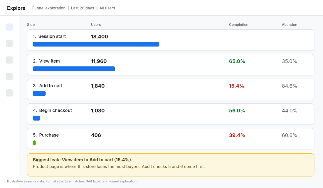
Look at the step completion rates, not the raw numbers. The step with the lowest completion relative to what you would expect is your first target. Typical patterns:
- Low session to view item: a homepage, navigation or collection problem. Visitors are not finding products.
- Low view item to add to cart: a product page problem. Price, images, shipping information or trust are failing.
- Low add to cart to begin checkout: a cart problem, usually surprise costs or a cluttered cart drawer.
- Low begin checkout to purchase: a checkout problem such as forced accounts, too many fields or missing payment methods.
The rest of the audit goes deep on each of those zones. The funnel tells you which zone to spend the most time in.
Pass: you can name your weakest funnel step on mobile and on desktop.
Fail: you are guessing.
Check 3: Test mobile speed before anything else
Speed is the quiet conversion killer because nobody complains about it. They just leave. A study commissioned by Google and run by 55 and Deloitte looked at 37 European and American brand sites across more than 30 million sessions. It found that a 0.1 second improvement in mobile load speed increased retail conversion rates by 8.4%.
That is a tenth of a second. Most Shopify stores carry an extra second or two from apps, uncompressed hero images and third-party scripts.
Run your homepage, your top collection page and your best-selling product page through Google PageSpeed Insights. Check the field data first, because it reflects real visitors, then the lab data for diagnosis. Look at Largest Contentful Paint (Google treats 2.5 seconds or under as good) and note which apps and images are the heaviest.
- Compress and resize hero and product images, and make sure only the first image loads eagerly.
- Remove any app you cannot tie to revenue. Each one adds scripts.
- Check that your theme is current. An old theme can be the biggest drag of all.
Pass: LCP is 2.5 seconds or under on mobile for your three key pages.
Fail: any of them is over 4 seconds. Fix this before you test anything else, because every other improvement is worth less on a slow store.
Check 4: Run the five-second homepage test
Open your homepage on your phone. Show it to someone who has never seen your store for five seconds, then hide it and ask three questions: what does this store sell, who is it for, and what would you click first?
If they cannot answer all three, your hero section is failing. This is the cheapest test in the whole audit and it catches the most embarrassing problems, like a hero image with no product in it or a headline that says “Welcome to our store”.
Check the following above the fold on mobile:
- A headline that says what you sell and who for, in plain words.
- One clear primary button that goes to your best-selling collection.
- A visible trust signal such as your review rating, free shipping threshold or Australian-owned badge.
- Your announcement bar, if you use one, saying something useful (see our announcement bar playbook for the formats that work).
Pass: three out of three strangers get it right.
Fail: you need to rewrite your hero before you touch anything else on the homepage.
Check 5: Audit navigation, collection pages and search
Shoppers who use site search are usually ready to buy, and most Shopify stores leave the default search untouched. Test it with the ten most common things your customers would type, including misspellings and synonyms. If “sneakers” returns nothing because you call them “trainers”, you are losing sales you already paid for.
Then walk the main navigation on mobile. Can a stranger reach your best-selling category in two taps? Do your collection pages show price, a review rating and a quick add button without opening the product? Is filtering available and does it work with one thumb?
Pass: search finds the right product for at least 9 of 10 test queries and your top category is two taps away.
Fail: fix your synonyms and menu structure before spending another dollar on traffic.
Check 6: Product page essentials (where most stores leak)
For most stores this is the most important page in the audit. Open your three best-selling products on a phone and tick off each item below.
- Price and delivery without scrolling. Show the price, the shipping cost or free-shipping threshold, and an estimated delivery date range in the first screen.
- Six or more images, including one in context. Add a close-up, a scale shot and one lifestyle shot. A short video helps (see our product page video framework).
- An Add to cart button that stays visible. A sticky button on mobile is worth testing.
- Size, fit or compatibility answers. Remove the reasons to leave and ask somebody else.
- Returns and warranty stated plainly. Baymard lists an unsatisfactory returns policy as a reason for abandonment for 13% of shoppers.
- Scannable copy. Lead with the benefit, then a short bullet list of specifics, and push the long description lower.
The single most common failure we find is shipping information hidden until checkout. Which brings us to the cart.
Pass: a first-time visitor can answer “how much is it, when will it arrive, can I return it” without scrolling.
Fail: any of the three needs a click.
Check 7: Trust and social proof
Baymard found that 19% of shoppers who abandoned a checkout did so because they did not trust the site with their credit card details. For smaller Australian brands without a household name, trust is part of the product.
Audit the trust signals a stranger sees in the first two minutes:
- Review rating and count visible near the product title, not buried below the fold.
- Real photos from customers, not only studio shots.
- A clear contact page with a real phone number or email, an ABN and an Australian returns address.
- Payment icons that match what you actually accept.
- Press or retailer logos, only if they are genuine.
We covered the nine types of proof and where each belongs in Social Proof for Shopify. Use it as the follow-up once this check shows you what is missing.
Pass: rating, review count and one piece of customer content appear on every product page on mobile.
Fail: you are asking strangers to trust you on faith.
Check 8: Cart and shipping clarity
Baymard’s research shows that extra costs (shipping, tax and fees) are the top reason for abandonment at 40%, ahead of slow delivery at 20% and being forced to create an account at 18%. Another 12% left because the total order cost was not visible up front.
That makes your cart the most valuable page to get right. Add three items and check:
- Is the shipping cost or a progress bar to free shipping visible before checkout?
- Does the cart show the real total, including GST, with no surprises?
- Is there a clear checkout button above the fold on mobile?
- Are you pushing upsells that delay the buyer? One relevant add-on is fine. Five is clutter.
- Does the cart still work if the buyer is logged out and on a different device?
Australian shoppers are very used to free shipping thresholds. If your threshold is not obvious from the product page, the cart or the announcement bar, you are making buyers do arithmetic.
Pass: a buyer sees the final shipping cost and total before they enter any details.
Fail: they find out on the shipping step.
Check 9: Checkout friction and payment options
Baymard reports that the average US checkout shows about 23.48 form elements by default, while an ideal checkout needs about 12 to 14. That is a 20 to 60% reduction in what you ask the buyer to type. Shopify checkout is already tight, so your job is to make sure you have not made it worse.
Place a test order on your phone and write down every point of friction:
- Guest checkout is on, and account creation is optional after purchase (18% of abandoners cited forced accounts).
- Optional fields such as company name and second address line are hidden or removed.
- Express options like Shop Pay, Apple Pay and Google Pay appear at the top.
- Buy now pay later (Afterpay, Zip) is offered, particularly on higher-priced items. Baymard lists too few payment methods as a reason for 9% of abandoners and card declines for 10%.
- The discount code field is not tempting people to leave and search for codes.
- Error messages are clear and keep the data the buyer already typed.
If you are still working out whether Shopify’s own instalment option is live for your store, we cover the current status in Shop Pay Installments Australia.
Pass: a test order on mobile takes under 90 seconds with a saved payment method and under three minutes without one.
Fail: you hit any dead end, error or unexpected field.
Check 10: Watch real behaviour with free heatmaps and recordings
The first nine checks are what you can see. This one shows you what shoppers actually do. Microsoft Clarity is a free behaviour analytics tool that provides click and scroll heatmaps, session recordings, and automatic detection of rage clicks and dead clicks. It has no session cap or traffic limit, so it will not cost you more as you grow.
How to set up Microsoft Clarity on Shopify in 15 minutes
- Create a free account at clarity.microsoft.com and add a new project for your store.
- In your Shopify admin, add the Microsoft Clarity app from the Shopify App Store and connect it to your Clarity project.
- Wait 24 to 48 hours (longer for low-traffic stores) so you have enough sessions to look at.
- In Clarity, filter recordings by Mobile and by Rage clicks, then watch 20 sessions end to end. Do not skim.
- Open heatmaps for your top product page and your cart. Look for taps on things that are not buttons and scroll depth that stops before your Add to cart or reviews.
- Write down every repeated friction point. Three recordings showing the same problem is a finding. One is an anecdote.
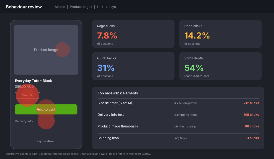
Common things to look for: shoppers tapping a size selector that does not respond, tapping product images that do not zoom, rapid back-and-forth between a product and a collection page (a sign they could not compare options), and a stall at the shipping information.
Pass: you have watched at least 20 mobile sessions and logged the top three friction points.
Fail: you are working from opinion.
The audit scoresheet you can copy
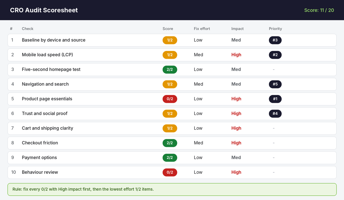
Score each of the 10 checks 0, 1 or 2: 0 means it fails, 1 means partly there, 2 means it passes. Then rate the effort to fix (low, medium, high) and the likely impact (medium or high). The twenty-point total is your starting score, not a grade. The value is in the priority list.
| Score | Meaning | What to do |
|---|---|---|
| 0 / 2 | Fails the check | If impact is high, fix this week |
| 1 / 2 | Partly there | Fix next, starting with low-effort items |
| 2 / 2 | Passes | Leave alone and revisit in 6 months |
Our rule for ordering the list is simple. Fix every high-impact 0 first. Then fix the low-effort 1s. Only after that should you look at medium-impact or high-effort items. If two items tie, pick the one closer to the checkout, because a gain there converts every visitor who got that far.
Your audit template, step by step
- Copy the ten checks into a spreadsheet with columns for score, effort, impact and owner.
- Block out three hours. Do checks 1 and 2 first (30 minutes), then 3 to 9 on your phone (90 minutes), then check 10 (60 minutes).
- Take a screenshot for every fail. Screenshots stop arguments later.
- Rank the fixes using the rule above and pick the top five.
- Set a one-week deadline for the first three fixes. Re-run the funnel in 28 days and compare.
The compound effect: why an audit beats a testing programme
Individual fixes look small. Showing delivery dates, a visible shipping threshold and fewer checkout fields each nudge the number a little. None of these feels dramatic on its own.
But your funnel is a chain of multiplications. A store converting at 1.5% that fixes the product page, the cart and the checkout and lifts each step by 10% does not gain 30%. It gains about 33% (1.1 x 1.1 x 1.1), taking 1.5% to roughly 2.0%. On 20,000 monthly sessions and a $90 average order, that is about 100 extra orders and roughly $9,000 a month, with no extra ad spend.
That is why we audit before we test. A slow site makes every test less valuable. A weak product page wastes the traffic from every ad. Fix the base and each dollar you spend on Meta, Google and email works harder. If you are also reviewing your spend, our guide to Meta Ads budgets for Shopify stores shows how to size it once conversion is healthy.
Mistakes to avoid when you audit your own store
- Auditing on desktop only. Most Australian traffic is on mobile. Do everything on a phone first.
- Auditing your own store as the owner. You know too much. Get a stranger to do the five-second test.
- Fixing everything at once. You will not know what worked. Make the top three changes, wait for 28 days, then review.
- Skipping the baseline. Without it you cannot prove the audit made a difference.
- Copying a big brand. A store with millions of customers can break rules a smaller one cannot.
Run the audit this week
You do not need an agency to find your biggest conversion leaks. You need an afternoon, your phone, GA4 and a free Clarity account. Work through the ten checks in order, score them, fix the top three and measure again in 28 days.
Inside eCommerce Circle, conversion is one of the core pillars we work on with every member. If you want to see exactly where your store is being capped, take the free More Orders Scorecard. It takes two minutes and shows you which of the 10 P’s to fix first.