The best Black Friday landing page puts one offer, one real deadline and one button on the first mobile screen, and nothing else competes with them. Everything else on the page, including your product grid, your story and your reviews, only matters if that first screen earns the scroll.
Most Aussie Shopify stores do the opposite. They reuse the homepage, bolt on a banner that says “BLACK FRIDAY SALE: UP TO 50% OFF” and wonder why paid traffic bounces. Black Friday this year lands on Friday 27 November, and the stores that build a dedicated page now will have three weeks of list-building before a single discount goes live.
This guide gives you the exact order of what goes above the fold, the wording formulas for the headline, how to set up a timer that does not lie, and a four-phase schedule so the same URL works from early November through to Cyber Monday. If you want the dates and deadlines first, start with our Black Friday 2026 dates for Australia.
Why the first screen decides your Black Friday
Open your analytics and look at the device split. During Black Friday Cyber Monday 2025, Nosto’s dataset showed 74.32% of store traffic came from mobile, and 67.25% of orders. Desktop made up only 25.68% of traffic. Yet desktop still converted better: 3.61% against 2.59% on mobile (Nosto, BFCM Holiday Shopping Statistics 2025).
That gap is your opportunity. Three quarters of your visitors are looking at a screen roughly 390 pixels wide, and they are deciding in a few seconds whether this page is for them. If the first screen is a logo, a rotating carousel and a vague banner, a big chunk of that paid traffic is gone before it sees a product.
The money on the table is real too. Australia Post’s 2025 eCommerce Report put shoppers’ spend during sales events like Black Friday and Cyber Monday at a record $2.2 billion, and its December 2025 update on the 2025 cyber weekend cited about $1.5 billion online across the weekend from 3.1 million households. Shopify merchants worldwide did $14.6 billion over the same weekend, up 27% on 2024, with Australia listed as the third-highest selling country (Shopify, December 2025).
So the competition is not small. Every one of those households is opening tabs for several brands. The page that is clearest in the first two seconds wins the click.
- Mobile first. Design the 390 pixel version, then scale up. Never the other way around.
- One job. The top screen has a single job: get the visitor to the sale collection.
- No homepage clutter. Strip the main navigation down to three links on this page, or remove it.
The six things above the fold, in order
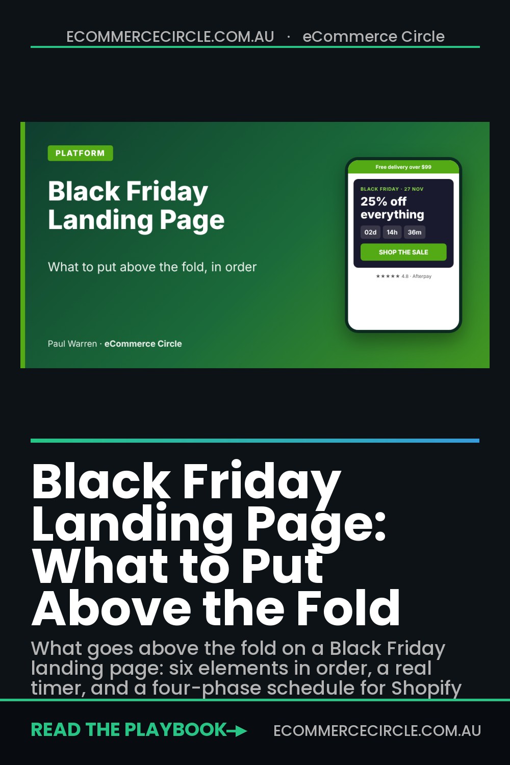
After auditing dozens of sale pages for Aussie brands, I use the same six-part stack every time. The order matters because it matches the order a shopper asks questions: Can I trust delivery? What is this? What do I get? When does it end? What do I click? Will other people vouch for you?
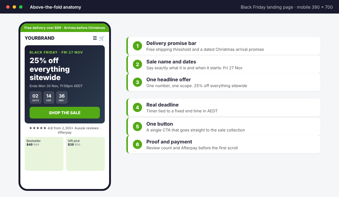
- 1. Delivery promise bar. Your free shipping threshold and, in November, a dated arrival promise such as “Order by Wed 16 Dec for Christmas”. Baymard’s research lists extra costs like delivery and tax as the number one reason for abandoned carts at 39%, so settle that worry before the shopper even scrolls.
- 2. Sale name and start date. “Black Friday · Fri 27 Nov” in small caps above the headline. It tells the visitor they are in the right place.
- 3. One headline offer. One number and one scope. “25% off everything” beats “Up to 50% off selected lines” every time because it is a clear promise.
- 4. A real deadline. A timer or an end date in Australian eastern time, tied to the actual end of the offer.
- 5. One button. A single call to action that opens the sale collection. Not “Learn more”, not three buttons.
- 6. Proof and payment. A review count and your buy now pay later options, shown before the first scroll.
That is the entire top screen. Anything that does not serve one of those six jobs moves below the fold or gets deleted. A video background, a brand story paragraph and a newsletter popup all fail that test.
Write one headline offer (and stop hedging)
The headline is where most stores lose the argument. “Our biggest sale of the year” says nothing a shopper can act on. The visitor has no idea whether you are offering 10% or 60%, so they leave to find a brand that tells them.
Use this formula: [Number] off [scope], [end point]. For example, “25% off everything, ends Monday”. Or, if you only discount some products: “Free gift with every order over $120”. If you cannot say it in one line, your offer is too complicated for paid traffic.
Three rules I give every coaching client:
- Name the saving in the headline, not the subhead. Subheads get skipped on mobile.
- Pick a scope the shopper can picture. “Everything”, “all skincare” or “the whole gift range”. Avoid “selected styles”.
- Protect your margin first. Australia Post found three quarters of businesses are worried that frequent sales are training shoppers to only buy on discount. Choose an offer your unit economics can carry, which our guide to the BFCM target maths walks through: The BFCM Target Maths.
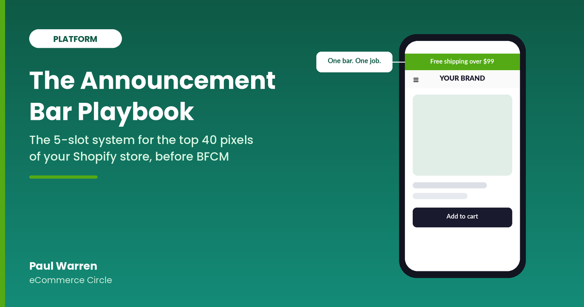
If you run a gift-with-purchase or tiered offer instead of a straight percentage, the formula still holds. State the trigger and the reward in the same sentence: “Spend $150, get the full-size serum free”. Then repeat the exact wording in your ads, emails and announcement bar so the offer never changes between click and landing. We cover the bar itself in the Announcement Bar Playbook.
Set up a countdown timer that does not lie
A timer works because the deadline is real. A fake evergreen timer that resets every time someone refreshes is a quick way to lose trust, and in Australia it can also land you in trouble for misleading claims. If the sale ends Monday 30 November at 11:59pm, the timer ends then, for everyone.
Here is the setup I use with Shopify clients, using the Hextom: Countdown Timer Bar app. Hextom lists a free plan with one auto-scheduled bar and a Premium plan at US$9.99 per month for multiple scheduled phases and visitor targeting, and it carries a 4.9 rating from 742 reviews on the Shopify App Store at the time of writing.
- Install and open the app. Add Hextom: Countdown Timer Bar from the Shopify App Store.
- Set the start and end timestamps once. For the live phase, use Friday 27 November 12:00am and Monday 30 November 11:59pm.
- Fix the time zone. Set it to Australia/Melbourne or Sydney. Hextom itself warns that the wrong time zone makes a bar go live at the wrong hour.
- Target pages and devices. Show it on the landing page, collection pages and the cart. Check the mobile preview before you publish.
- Queue the phases (Premium). Build the teaser, live and last-chance bars in advance so nobody has to edit anything at midnight.
- Test on a real phone. Open the page on mobile data, not just your office wifi, and confirm the countdown matches your Shopify discount end time.
One more rule. Make sure the timer matches the discount itself. If your automatic discount in Shopify ends at 11:59pm but your timer says midnight, you will get angry emails from people who arrived in the gap. Set both to the same minute.
Use the weeks before Black Friday to build the list
The strongest Black Friday landing pages are not built in the last week. They go live in early November as a sign-up page, collect emails and SMS numbers, and then change their hero as the sale gets closer. That way your list grows for three weeks, and your best customers hear about the offer before the public does.
Gymshark’s Australian Black Friday page is a good live example. When we checked this week, the page said “You’re Early. Good.” and “The sale isn’t live just yet”, offered a sign-up for newsletter or app push alerts, and kept the start time a secret. The promo bar above it still rotated through 15% off for email sign-ups and free shipping over $100. No timer, no price, just capture. The North Face does a similar thing with its “Black Friday is coming” page, pointing visitors to early access deals and loyalty benefits (both per Hostinger’s 2025 landing page roundup).
If you have not built your early access list yet, the BFCM Early Access List Playbook covers the sign-up incentive, the double opt-in and the SMS consent wording. The point for this article is simpler: one URL, four phases, and you only swap the hero.
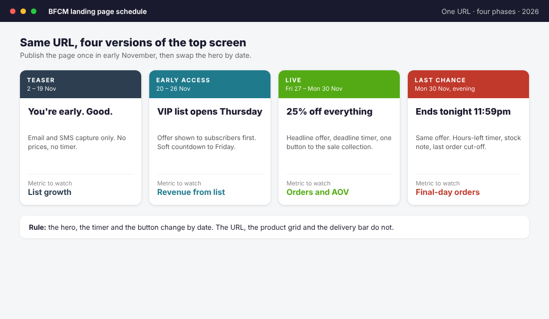
- Teaser (2 to 19 November). Headline: “You’re early. Good.” One email and SMS field. No prices.
- Early access (20 to 26 November). Offer shown to subscribers via email link. Public visitors still see the sign-up form with a soft countdown to Friday.
- Live (27 to 30 November). Headline offer, deadline timer, one button to the sale collection.
- Last chance (Monday 30 November evening). Same offer, hours-left timer, stock note and last order cut-off.
Build the page once. Duplicate the hero section four times in your theme editor, then use a scheduling app or a quick manual switch on each date. Keep the URL the same so any ad, email or backlink you set up in early November still works on the day.
Fix the checkout worries before the click
Black Friday shoppers are comparing prices across tabs. If your first screen hides the delivery cost, your returns policy or your arrival dates, they will find the answer on a competitor’s page instead.
Baymard’s research puts the leading causes of cart abandonment at extra fees such as delivery and tax (39%), slow delivery (21%), forced account creation (19%) and a checkout that felt too difficult (18%). Australia Post’s own 2025 report adds that 85% of shoppers say reliable delivery will be the most important factor in trusting an online retailer, and more than half rate free delivery as their top preference. Your landing page can answer every one of those worries without a word of waffle.
- State the free shipping threshold in the top bar. “Free delivery over $99” is enough. If you do not offer free shipping, show the flat rate.
- Put a dated Christmas promise near the button. Check Australia Post’s published cut-off dates and quote the real one, not a guess.
- Mention guest checkout and Shop Pay or Afterpay. Small icons near the button remove the forced-account-creation worry.
- Link to a plain-English returns policy. Gymshark’s Black Friday page runs an extended returns window across the holiday period, and it works because the FAQ spells it out clearly.
If your returns policy gets messy over the holidays, our Gift Returns Playbook shows how to keep the revenue in January instead of refunding it.
Build the mobile version first, then check it on a real phone
Your desktop preview is lying to you. A hero that looks sharp on a 27 inch monitor can push the button 900 pixels down on a phone, which means a third of your visitors never see it. Take these four checks to your own phone before launch:
- The button must be visible without scrolling. On a standard iPhone screen, your offer, deadline and button all need to show. If they do not, shorten the headline or reduce hero padding.
- Compress the hero image. Keep it under 150KB, or drop the photo and use a solid colour block. A fast page converts better than a pretty one.
- Check the tap targets. Buttons at least 48 pixels high with space around them. Thumbs are not mouse pointers.
- Cut the menu. Three links at most: Shop the sale, Gifts, Help. Everything else is a distraction on this page.
BIKE24’s Black Friday Week page, featured in Hostinger’s roundup, is a good model of restraint: one clear heading, a daily deals badge, a prominent countdown and a newsletter invitation. It does not try to be the homepage. Neither should yours.
Measure the page like a dashboard, not a feeling
You will not know whether the landing page is working unless you track the same five numbers each day. Set these up in GA4 or your Shopify analytics before the sale starts so you are not building reports at 6am on Black Friday.
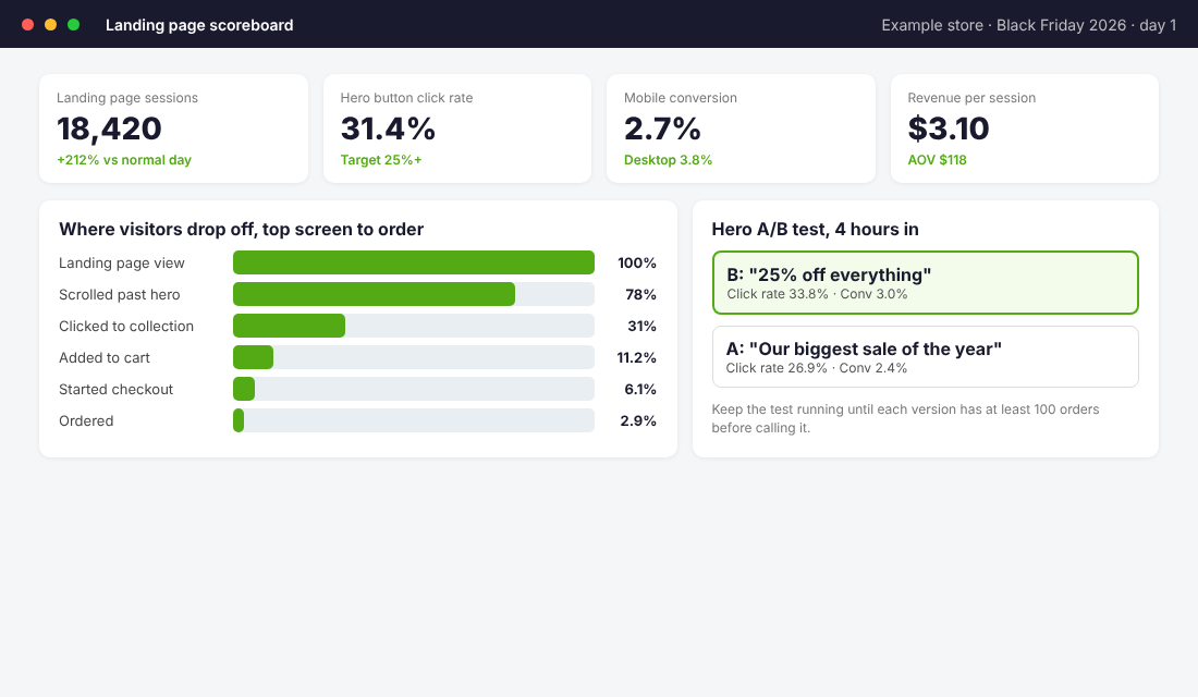
- Hero button click rate. The share of landing page visitors who click through to the sale collection. If this is under 20%, the headline or the button is the problem.
- Scroll past the hero. This tells you whether people are engaging or leaving immediately.
- Mobile conversion rate versus desktop. Compare against Nosto’s 2.59% mobile and 3.61% desktop benchmark. Both numbers are fine to beat.
- Revenue per session. Landing page conversion alone hides discount depth. Revenue per session shows what each visitor is actually worth.
- Add to cart to checkout. A big drop here points back to delivery cost or payment options, not your headline.
For the testing itself, change one element at a time. Test the headline wording first, then the button text, then the hero image. Our Shopify CRO audit explains how to read a result without fooling yourself with a few dozen orders. As a rule of thumb, wait for at least 100 orders on each version before calling a winner.
Microsoft Clarity is a free way to watch where mobile visitors tap and stop scrolling. Install it a week before the sale, so you have a baseline.
Your Black Friday above-the-fold checklist
Copy this into your project tool and tick it off before you send paid traffic. If a line is a no, fix it first.
- ☐ One sale name and start date shown above the headline
- ☐ Headline states one number and one scope (for example, 25% off everything)
- ☐ Deadline is real, in AEDT, and matches the Shopify discount end time
- ☐ One button, opens the sale collection, visible without scrolling on a phone
- ☐ Free shipping threshold and Christmas delivery date shown in the top bar
- ☐ Review count and payment options (Afterpay, Shop Pay) visible on screen one
- ☐ Navigation reduced to three links or removed
- ☐ Hero image under 150KB, page loads in under 3 seconds on mobile data
- ☐ Email and SMS capture live on the teaser version of the page
- ☐ Five tracking numbers set up and checked on test day
- ☐ Same wording used in ads, emails and the announcement bar
- ☐ Last-chance version built and scheduled for Monday 30 November
Most stores can tick the first six in an afternoon. The tracking and the phases take a bit longer, but they are what separate a page that is just a banner from a page that makes money for three weeks.
How the pieces work together
The reason this approach works is that every element supports the next one. The delivery promise removes the cost worry, so the headline can focus on the offer. The real deadline makes the offer feel urgent without feeling pushy. The single button means traffic from your ads has nowhere to wander. The proof removes the last doubt.
Then the phase schedule multiplies it. The teaser builds the list, the list drives early access revenue, the live page converts the paid traffic you buy through your Black Friday Meta ads plan, and the last-chance version catches the stragglers. The result is a page that works for three weeks instead of three days. If you want a broader view of your page structure, the Shopify Landing Page Playbook covers the full layout beneath the fold.
Start with the six-part top screen this week. Test it on your own phone tonight. Get the teaser live before the first week of November and you will go into Black Friday with a list, a tested page and a plan.
Inside eCommerce Circle, your landing page and checkout path are core pieces of the Platform pillar we work on with every member. If you want to see exactly where your store is being capped, take the free More Orders Scorecard. It takes two minutes and shows you which of the 10 P’s to fix first.
Sources: Nosto, BFCM Holiday Shopping Statistics 2025; Shopify, BFCM 2025 data (2 December 2025); Australia Post eCommerce Report 2025 and its 9 December 2025 cyber weekend summary; Baymard Institute, cart abandonment research; Hextom app listing and blog; Hostinger, Black Friday landing page examples; Gymshark AU Black Friday page.